who's nxt?
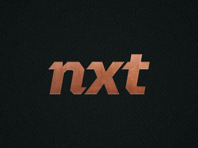

Working on a brand refresh for a local youth sports company. It has to work as a system across all different kinds of sports so I was looking to slightly modify an existing typeface (United Italic Regular) so the company would have no problem adding new programs to their logo down the line (see attachment). I know that bottom cut in the "t" is kind of weird but when I use the same angle as the X it makes the "t" look like it's off in no man's land, any suggestions on that?