iPad Layout v2.0
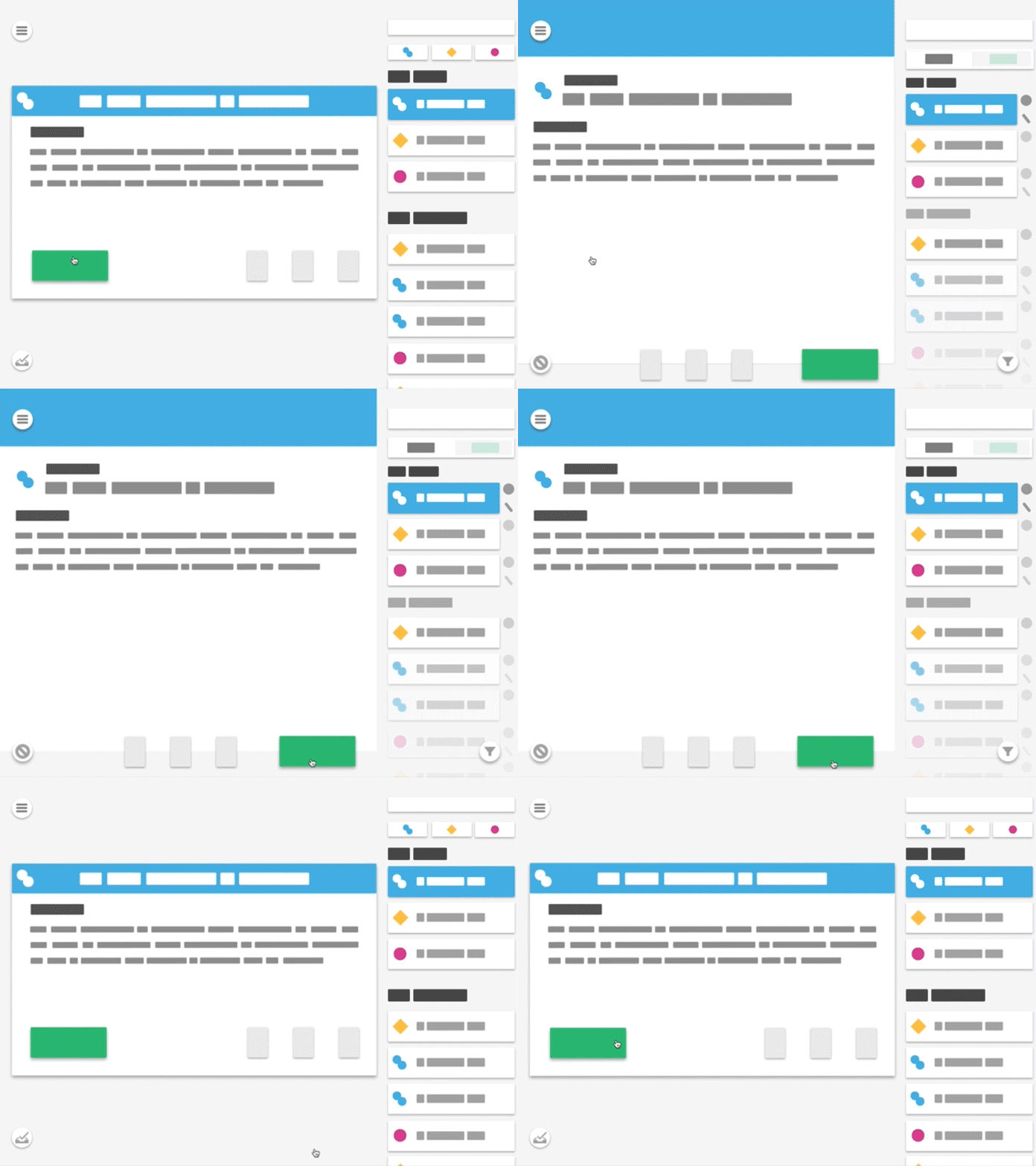
We're working on a new version of our retail productivity app, so I did this layout in atomic to show the differences between v1 and v2. Because animation, and atomic is just awesome.
Less static containers, a better utilization of the card list's space, uniform control along the bottom of each task, tabbed list, revamped filters... it's more scalable. Now to see if the dev effort is able to be scoped.
More by Tom Johnson View profile
Like
