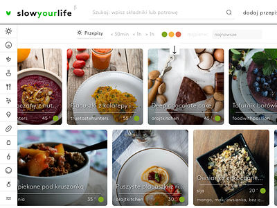
Slowyourlife produt list
Some time ago I designed a cool website. It was based on horizontal scroll. Most crucial in that case was to bring great experience for laptop users – so we switched the vertical mouse and touchpad scroll, what's more – we also added arrows of 'pagedown'.
You can see it live here: https://slowyourlife.com/przepisy
But the best part is that I based responsivity of the website on both horizontal and verical size – some parts of interface were responsive for width (like top navi bar, etc), other on height (page content, but also header).
Oh yeah – soon I will also add some mockups to see how it went :-)
More by Igor Farafonow View profile
Like


