Resy
Redesign of Resy’s consumer app powers restaurant discovery and booking all in one place.
What do you use Resy's for?
Find restaurants in the area you’re looking to have a meal in, view restaurant location, rating, price range and the free time slots to book the restaurant for you and your party.
Finding the problem
At first glimpse the visuals of the app don't match the current brand identity. The usage of blue on dark colours makes the app look heavy and hard to read. It's hard to understand the structure of the app and its navigation. Search should be the core feature of an app to find restaurants and venues, yet this one seems lacking.
Challenge Objective
Improve findability and discoverability.
How Might We…
Make the product more trustworthy and reliable?
Goals
Improve Filtering Feature: Turn this into feature into a power-up so users can find what they are looking for without so much friction.
Improve Conversion Rate: Make it easier to find and book a place.
Make it lighter: Make the page cleaner and more friendly by adding more photos of venues and dishes.
Success Metrics
Abandonment Rate: The abandonment rate of users who didn’t end up making a reservation
Conversion Rate: The percentage of visitors that ended up booking a place out of the total number of visitors
Bounce Back: Users that comeback to the app to book a place they have saved in a previous visit
Wireframes and User flow
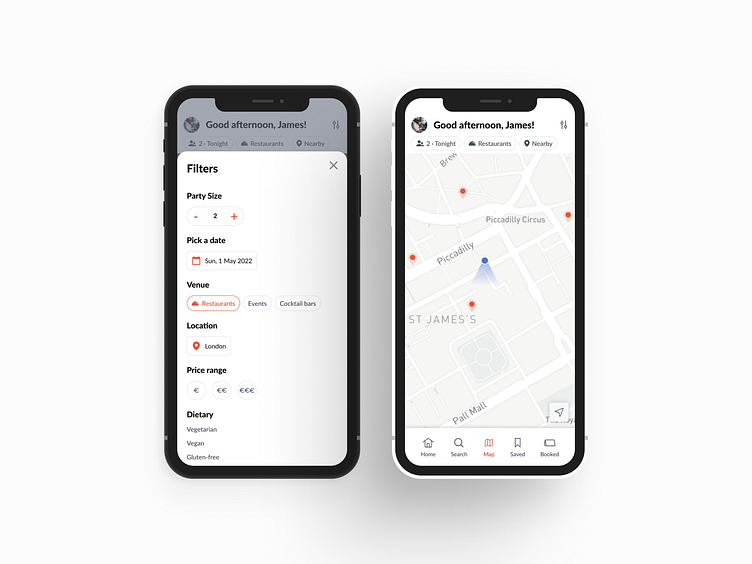
Researching apps in the same market segment noticed that the usage of bottom navigation enhances user usability to switch between text search, map and home, added a couple more for saved venues from previous searches and a another for current and previous reservations for quick access.
Walkthrough Experience
The homepage central focus are the restaurants with photos taking the spotlight so that users can empathise with the venue. Separating the map and the venue listing, brings more clarity for map navigation as well as a better control of the hand gestures used to navigate the lists. Utilising filter criteria to narrow search and make it easier to specify is one of the big improvements, allowing users to specify dietary, price range, date, venue… The search bar also allows for other concepts like specific food, cuisines… Adding a possibility to save venues for when you find a interesting one but without vacant seats for you or your party, also allows for bounce back to that venue with ease.
End Result
Managing to secure all goals and improving this product’s findability and discoverability, ensured by the filtered search power up and the bottom navigation, together with the uplift on the user interface to make it more friendly and light, this was a very gratifying challenge to take on. Also the first time that tackled a challenge in this market segment, which made the process even more exciting.


