Zalando Material Design concept
We had a look at the Zalando App for Android.
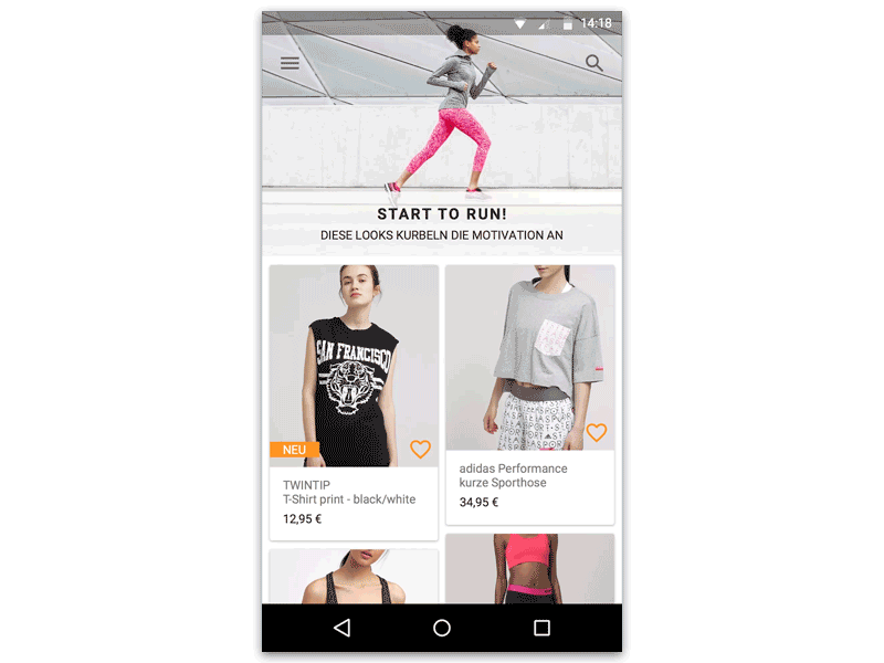
We thought to ourselves: What would this App look like in Material Design?
Here's a concept.
Features:
- Animations, animations, animations
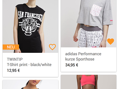
- Full blown imagery
- Intelligent background color which changes accordingly to main color from top image
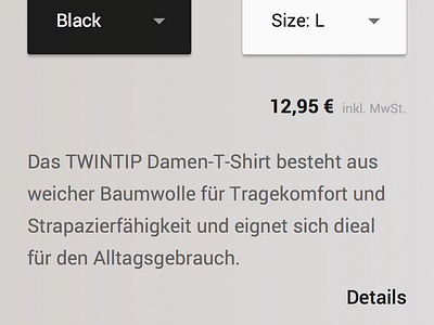
- Colored Buttons indicating product color
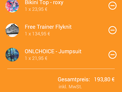
- Straight-forward checkout experience
- Fab button as main call-to-action (Shopping Cart)
See the full animation video here:
https://goo.gl/E4HnEn
More by Goodpatch Tokyo View profile
Like


