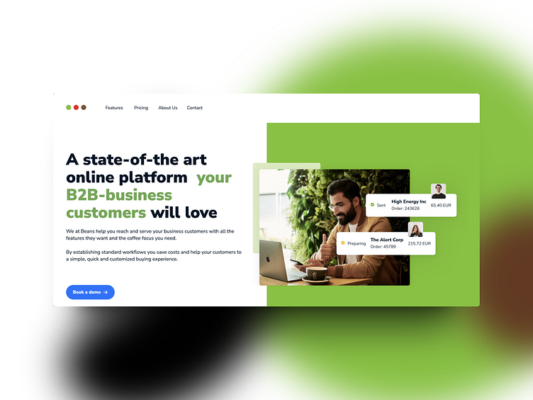
Website - getbeans.com
During my tenure as a Head of Product Designer at getbeans.com, I had the opportunity to contribute significantly to the development of the website. My responsibilities revolved around transforming abstract concepts into tangible design prototypes while ensuring a seamless user experience (UX) and cohesive visual aesthetics that aligned with our brand's vision.
Enter your texI had the privilege of collaborating closely with CEO & Marketing Department and Developers, to gain in-depth insights into the website's goals, target audience, and overarching vision.
Brainstorming and ideation sessions were a regular part of my routine, allowing me to generate innovative design concepts that drove the website's development.
My primary focus was translating conceptual ideas into practical wireframes, mockups, and prototypes using Figma tool.
I aimed to create designs that not only looked visually appealing but also provided a user-friendly experience, considering aspects like responsive design and accessibility.
I took pride in maintaining consistency with brand's visual identity, aligning design elements such as colors, typography, and imagery with our established brand guidelines. This ensured a cohesive online presence.
Working closely with Beans proficient front-end and back-end developers was integral to my role. This collaboration ensured that my design concepts seamlessly integrated into the website's code.
Addressing feedback and iterating on designs based on developer input and constraints was essential to ensure a smooth implementation.
I remained committed to staying up-to-date with the latest industry trends, best practices, and emerging technologies in web design and UX. This ensured that our project remained competitive and user-focused.


