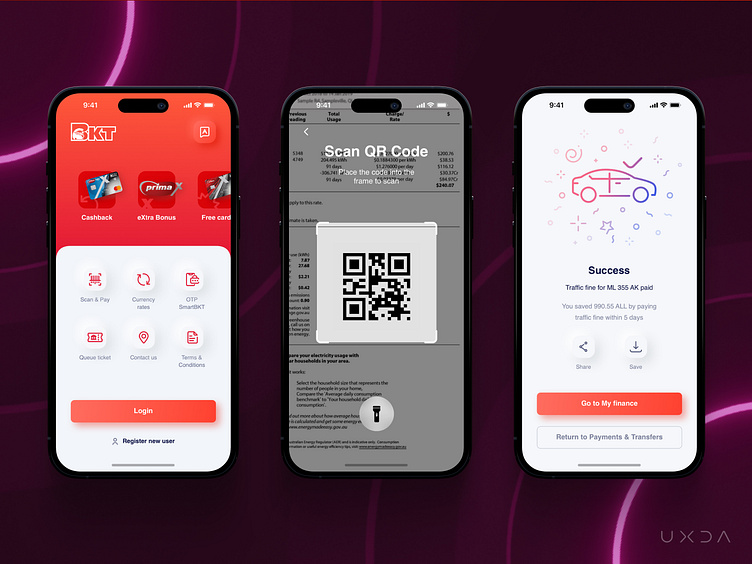
Revitalise Design & Tone of Voice to Become More Approachable
All the design elements combined created a light and positive feeling, with contrasting colours and a light gloss adding a sense of energy and movement while, at the same time, maintaining safety, approachability and friendliness. Additionally, the interface's smooth transitions improved the user experience when switching between tabs or menu items.
Read the full case study here.
Lets talk how to increase your financial product value!
More by UXDA | Financial UX/UI Design View profile
Like

