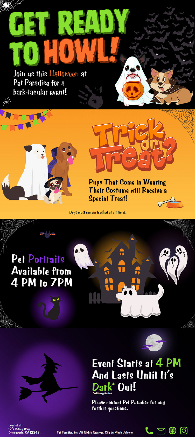
Bark-tacular Halloween Event Webpage
Company Information: Pet Paradise is a locally owned pet store that serves small & large animals within its community. They are trying to increase brand awareness by hosting fun community events. Currently, they only own one store and take small online orders, but they will be opening a second store soon in a neighboring city.
Pet Paradise has decided to host an event geared towards dogs. On Halloween, they will be giving away free dog treats to pups that come in dressed in a costume. There will be a photographer on site available to purchase pet portraits for a portion of the event. The event will start at 4 PM and will continue until they run out of treats or it gets dark.
Problem: Pet Paradise needs a way to notify the community about their upcoming Halloween event for dogs.
Research & Information: The store is located in Bend, OR, with a population of 102k. The town has grown in recent years due to the state colleges in the state becoming increasingly popular. Individuals living in the area enjoy participating in outdoor activities, attending concerts & events, and beer tasting. Bend has many breweries throughout the area making it a popular destination for travelers. Most of the breweries in the area allow dogs to come in with their owners. In Downtown Bend, you will see drinking stations for pets outside of local restaurants. The area has 22 different veterinary clinics alone and countless pet stores due to its rural neighbors.
Objective: The company would like a landing page built that announces the event to the community. The webpage will be linked to a QR code which will be printed on flyers distributed through the city. The design should depict animals dressed in costumes and Halloween. It should also provide necessary information about the event to excite individuals.
Process: Since it is Halloween, I knew I needed a vibrant and bold color palette, so I searched Halloween photos in Google Images and when I found one that was aesthetically pleasing, I uploaded it to Coolers (affiliate link) to generate the colors in the photo. The generator produced the following hex codes: #373038, #862FE0, #88E032, #FB702D, and #FFC341 were the primary colors I worked with.
Next, I knew I needed to find multiple pets dressed in costumes. The bold colors required any imagery used to have clear and crisp lines. I searched a few different sites that sell graphics and found several on Creative Fabrica (affiliate link) that I liked.
Once I had the color pattern, I began working on the website. It needed to project a fun image since it was for pets and likely children would also be attending. First I wrote a rough draft of the copy that would be displayed on the webpage. After I was done with that, I started placing the different pieces of information with different images. I decided to go with a slide deck and use each slide for a different piece of information. This would allow me to use different scenes on each slide as well and really project that fun image.
I decided against building a wireframe with this design because of the fun and bold design. I wanted to see the imagery and the colors together to see how they contrasted before deciding on a layout. Since it was a landing page, there was no need for the usual header structure at the top of the page. I decided to place the copy on opposite ends of every slide to help keep the viewer interested in continuing reading. I included the client's contact information as well as linked icons at the bottom of the page.
Challenges: This was my first experience using gradients to build depth within a design. It was a learning curve.
What I Would Do Differently: The transition between slide 3 and slide 4 is too subtle. I would aim for a more dramatic transition so viewers are aware that there is more information and to keep scrolling.
Remove the cat on slide 3 and add more information from the photographer about the pet portraits.
Add the clients logo in the footer.
Feedback: This was an AI-generated prompt that I used in order to gain experience and build my portfolio. I decided to use Bend, OR as it is a city that I am slightly familiar with, but not enough that I could do the design without researching the area first.
I am always open to constructive criticism and would love to hear where and how to improve. I will warn you though, that I'm a curious individual and will ask questions on anything I don't understand.
Thanks,
Nicole Johnson
