Parcel Manager
What is it?
A full stack custom web application business tool that manages the deliveries of parcels.
Helps by creating jobs and assigning a custom status, reference, client, driver, and more.
Allows adding notes and uploading files for improved communication between teams.
Can apply custom fees per job for quick estimates and grand totals.
Why is it?
My client's business was outgrowing their current technology quickly, and existing applications did not meet their needs in terms of pricing, features, and support.
Where is it?
You're welcome to visit the live demo. Updates are continuous and features may change over time.
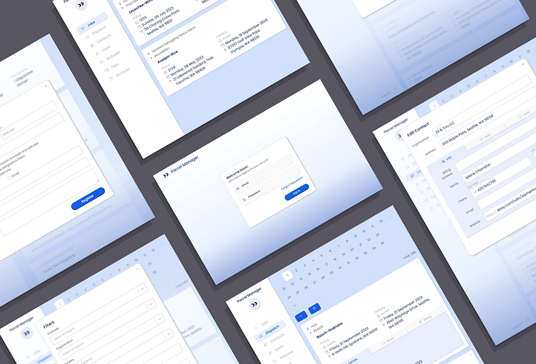
UI/UX Design
Most of the users will on mobile phones and constantly on the move. The main challenge during this design process was displaying the most information without cluttering.
This was solved by listing important data first, pairing content with icons as visual aide, and allowing the user to expand/collapse optional data when needed.
Each page presents its records as cards. Every card lists the most important information first above a bolded name. Next, the card's main content data gets paired with icons to help with easy identification. Finally, additional data is organized in tabs which can be revealed by expanding the card via its ellipsis menu.
As an example, the dispatch page lists the status and reference first, followed by the name of the client in bold.
The content is the pickup and delivery details. Subheadings and icons are a subtle gray to make the list of items easier and to prevent making it feel cluttered.
This card is expanded to show the optional data organized in tabs.
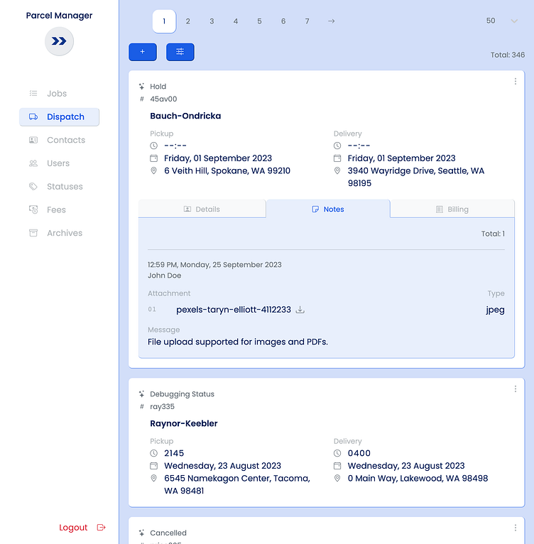
The same principles can be seen on all other pages.
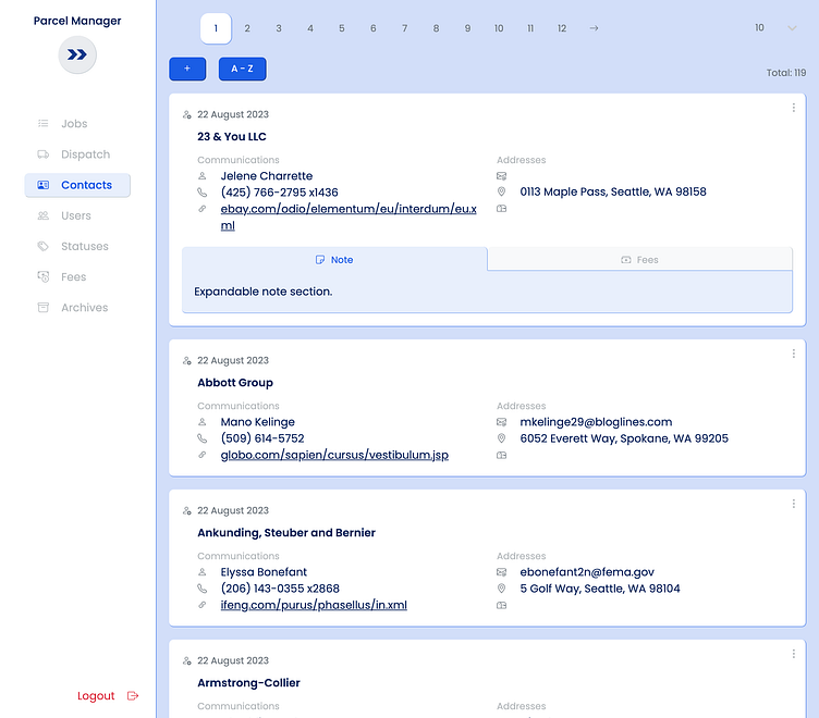
On the contacts page, only one important data is listed above the bold contact name, and not so many tabs are needed.
Despite some pages not having as much data to display, the same structure is still used.
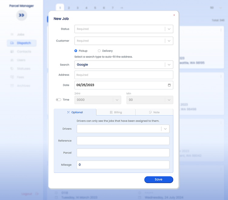
Forms
Creating a job requires the most user input. The challenge was to reduce manual input and avoid cluttering.
I solved this problem by incorporating input elements for required fields that allows the user to fill it in with a single click/tap, which saves a record quickly and accurately.
All other optional fields use manual type elements when absolutely needed.
To avoid clutter and improve readability, I aligned the labels to the right and its input to the left.
Mobile First
Responsive layouts adjust based on the screen size of the device being used.
For every page, form, and card its layout shifts based on the screens resolution, but still upholds its display design principles.
Enjoy a snippet of the web application being used on a mobile phone by a driver reviewing their job assignment.