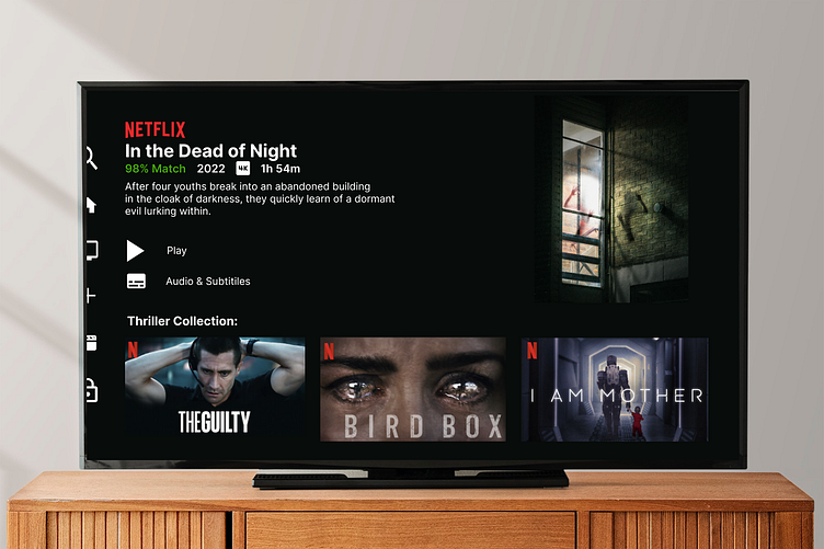
Netflix Homescreen
I challenged myself to create the UI of the Netflix homepage earlier this year (original date: 1/19/23) due to most of my past work being mobile screens.
What would I change? The sizing of the iconography is crazy! I have no idea how I didn't notice it before (probably after spending time staring at the same screen--which is why its important to take breaks when designing 😅). The icons are way too big and I would even adjust the spacing in the "play" and "audio & subtitles" text--the typography looks as if it is randomly floating on the screen instead of being within close proximity to the main text body. I personally think the Netflix title could be a little bigger as well.
More by Symone Zinemon View profile
Like
