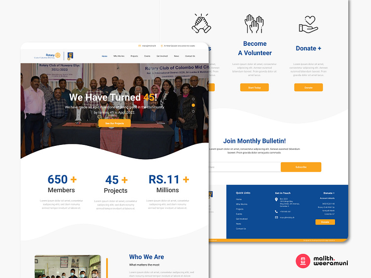
Rotary Sri Lanka Website Design Concept
Rotary Sri Lanka Website UI Design 🚀
Elevating digital engagement for Rotary Sri Lanka, our UI design reflects a harmonious blend of aesthetics and user-centric functionality. Rooted in UI/UX design keywords such as "intuitive," "interactive," and "engaging," our approach ensures an immersive online experience for Rotary Sri Lanka's diverse audience.
Our design philosophy prioritizes user-friendliness, featuring an intuitive navigation structure, clear information hierarchy, and interactive elements that enhance engagement. A harmonious color palette, clean typography, and responsive layouts create a visual aesthetic that seamlessly aligns with Rotary Sri Lanka's mission of service and community.
Choose our Rotary Sri Lanka Website UI Design to amplify your online presence, effectively conveying the organization's values and initiatives. Let our UI design be a testament to design excellence, inviting visitors to explore and actively participate in Rotary Sri Lanka's noble endeavors.
📩 Let's Collaborate: Inspired to join hands in this creative journey? Reach out at malithweeramuni@gmail.com to collaborate, innovate, and amplify the fusion of design and charity.
Thank you for exploring the Arch Tracker Desktop App UI/UX concept. Show your appreciation with a "L," and let's weave compassion into every pixel! ☕🌍🎉


