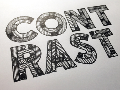
Contrast ::: Hand-Lettered Typography
Contrast—Keep it high and things will be showing out!—created on 9.3.15.
This hand-lettered composition is one of many from a daily fifteen-minute(ish) hand-lettering blog-project that I've been working on since January 1st, 2013 entitled Accidental-Typographer. Thank you for looking!
More by David J Short View profile
Like
