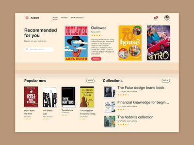
Audible Landing Page Redesign Challenge
tried to make this website more like a real-life bookshelf, where books are placed. The overall color palette is calm and focused, and the typography is legible.
More by Harish View profile
Like
