Slider Interaction
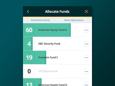
Consideration for a larger slider interaction on mobile, allowing the user to interact with the entire row to allocate an amount (as opposed to the default slider 'knob'). Aside from the benefit of an easier interaction on mobile, the allocation bars present a bolder graph of allocation amounts. Might be worthwhile to test learning curve to begin allocating.
More by EY Design Studio PHL View profile
Like
