The Hundred | Brand Identity Design for reformer pilates studio
Brand Identity development for Reformer Pilates Studio
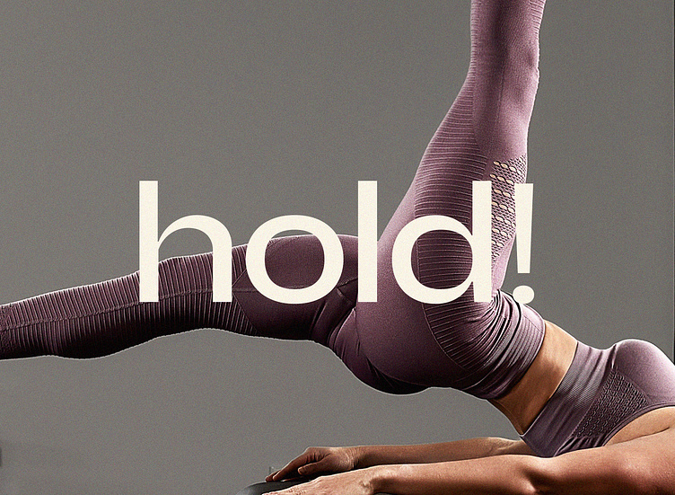
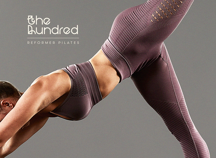
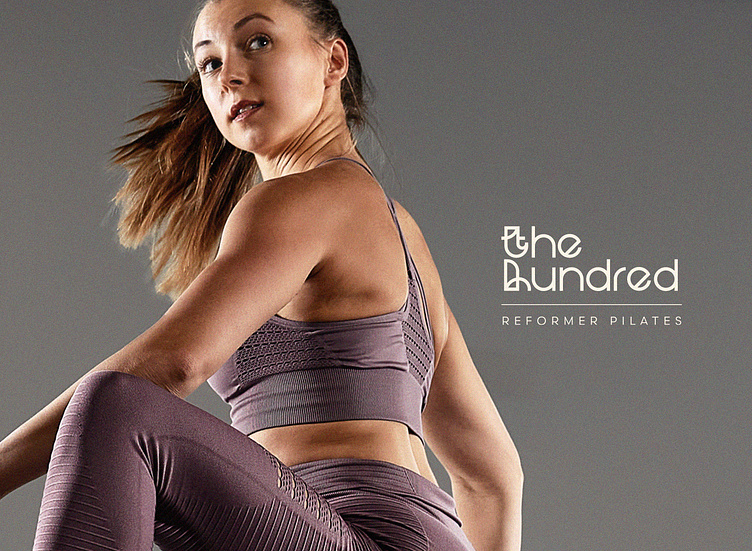
The brief for this fun project was to create a brand design that resonates with women and men who love to challenge themselves. They take the workout seriously. They value community, and they are independent and confident. Music is massive here, too. It creates an atmosphere of dynamism and unity.
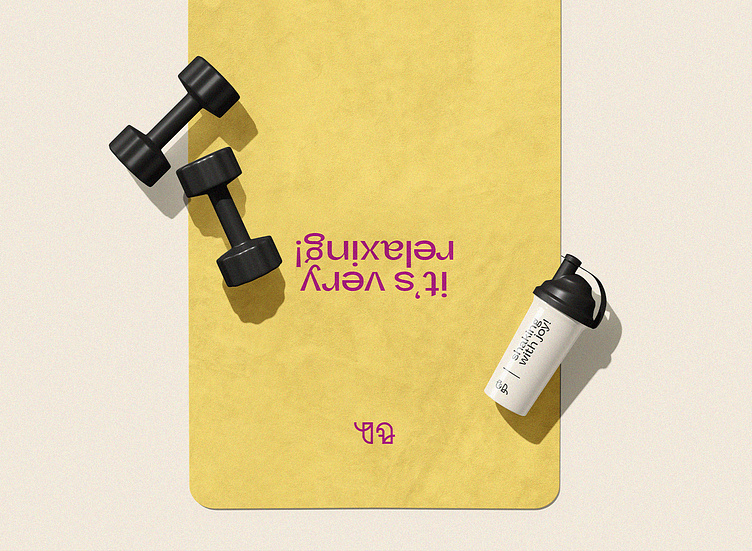
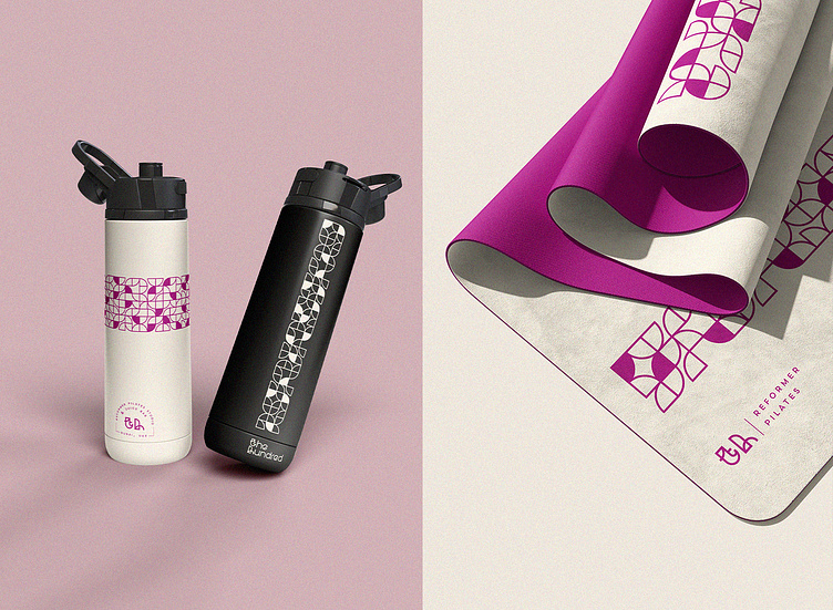
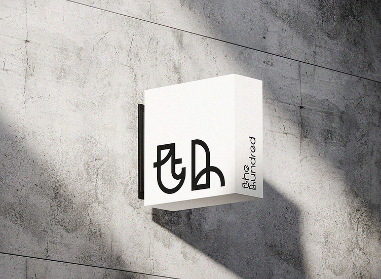
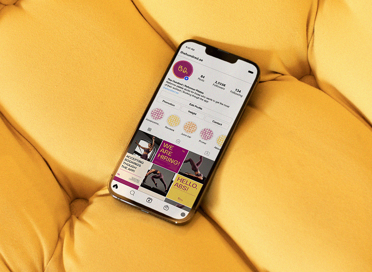
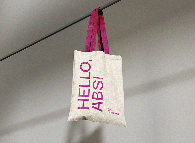
The logo concept is sporty yet refined. I chose undecorated, geometric, and rounded typography and developed a touch of customization. It communicates precision, balance, movement, and perfection. It also has a friendly feel, as the doors of the studio are open for everyone who likes to put effort into their routine. Colors are bold and vigorous, with fuchsia and yellow being the primary colors.
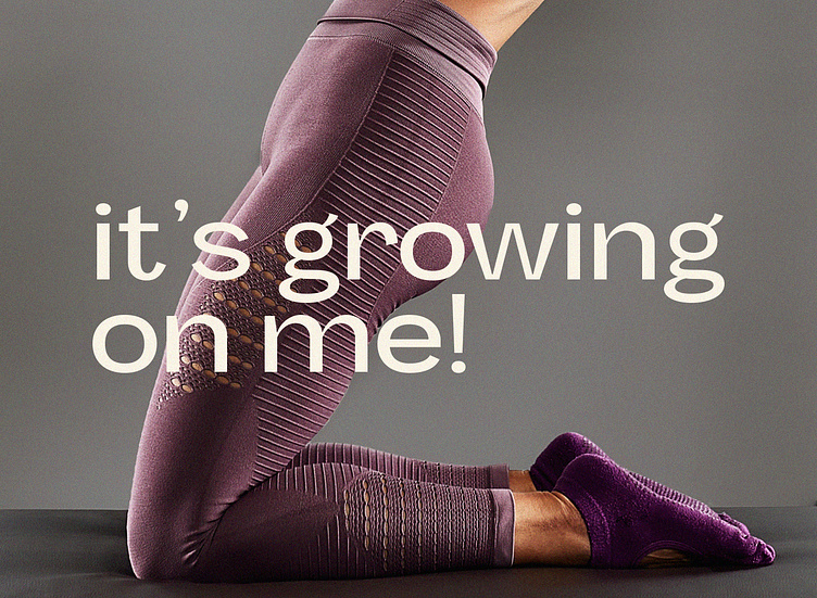
The brand uses bold statements and "pun intended" quotes. They add to the fun atmosphere of the studio and its members. They are a group of bold and unapologetic personalities who motivate each other to do their best.