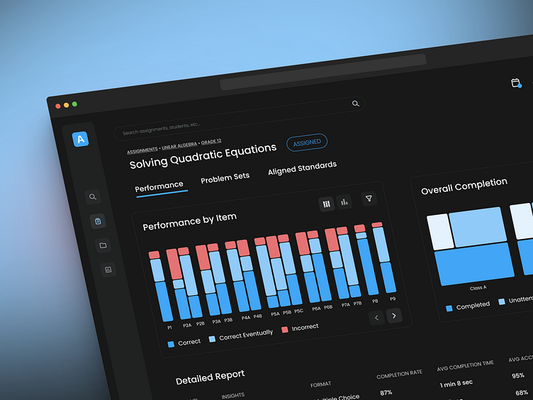
Education Dashboard • Learning Assessment • Dark Mode • Mondrian
Hey there, design community 👋
Here's a something I put together with a little inspiration from the work of Piet Mondrian. The visualizations in this dashboard focus on quick, actionable, qualitative take-aways.
The goal here was to drastically reduce cognitive overhead for visualizations that don't need additional labels, annotations, y-axis ticks, and so forth.
More by dmartuk View profile
Like


