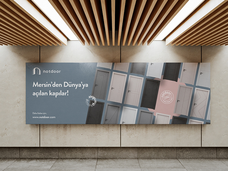
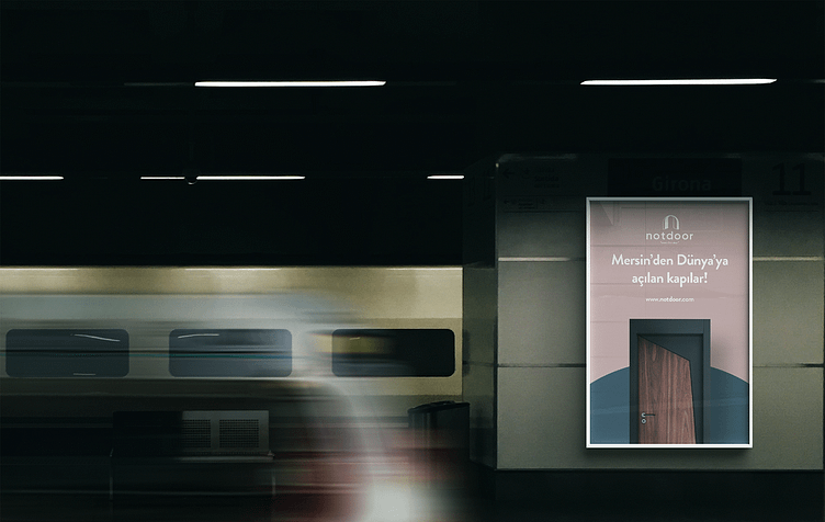
Notdoor Logo + Branding Design
A business owner with over 24 years of experience in the furniture industry decided to focus exclusively on the design and production of doors. The foundation for a door factory was laid, and there was a need for a brand name, slogan, logo/corporate identity designs, branding, and brand positioning.
In creating the brand name, the focus was on the idea that doors are not just functional entry points but also expressions of aesthetics, security, and modern lifestyle. Doors are passages that add meaning to people's lives when they enter and exit. Notdoor aimed to go beyond this meaning and transform doors into an experience beyond the ordinary. It was not just about designing and manufacturing a door... We had actually found the brand name in line with this sensitivity.
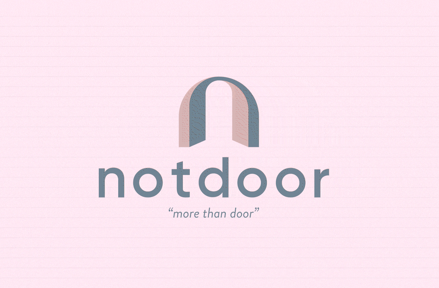
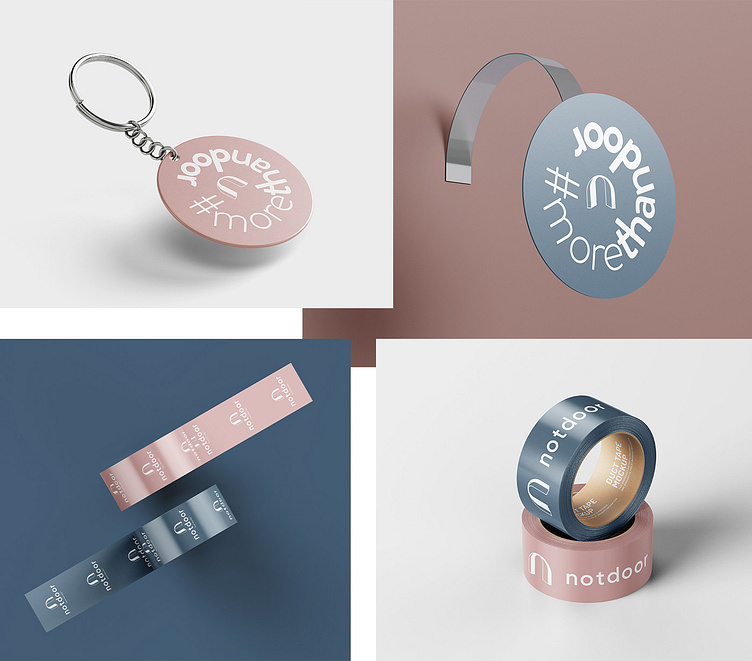
more than door
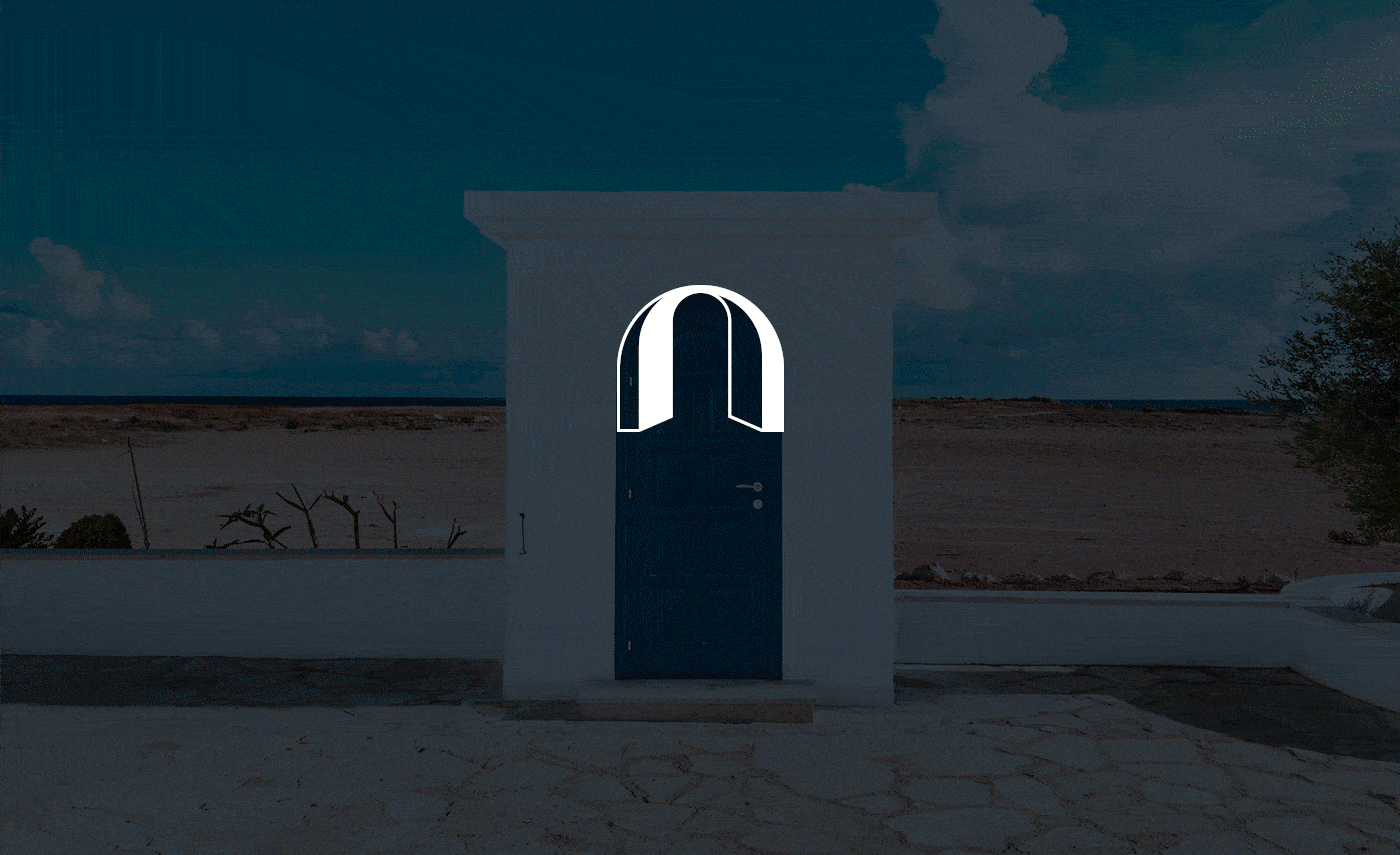
We used the letter 'n' in the design to represent the Notdoor brand. Inspired by doors with oval-shaped upper parts, we created a round 'n' letter. The rounded lines reflect the brand's friendly and approachable nature, while simplicity and clarity emphasize Notdoor's values of reliability and professionalism.
The slogan "more than door" underscores that doors are more than just functional items. Our slogan reflects the philosophy of Notdoor, aiming to provide customers with a door experience that adds meaning to their lives. Notdoor aspires to transform living spaces by offering not only an entry point but also values such as aesthetics, functionality, security, and modernity.