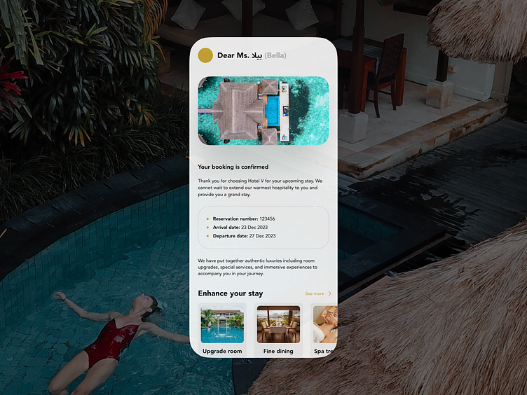
Confirmation - Hotel Booking
The Context
This case study is a part of the Daily UI series. Facing a creative road block, I pulled the wild card and went with 'Prompt: Confirmation'.
I wanted to break the rut of a perfectionist on "beauty" over structure. I aimed to design things based on my recent experience as a customer on enhancing a confirmation booking emailer. This exercise was liberating, as I could experiment on what is the best way to show and categorize information?
The Brief
Objective
Design a Confirmation UI element. What's being confirmed? Is it confirming an address, order, shipping, plane tickets, hotel reservation, dinner reservation, booking tickets to the opera, or something else? Also consider where it's occurring (i.e. website, mobile app, email confirmation, etc.)
Audience
It targets an individual who is booking and checking their emails on the go, which is why I went with a mobile interface. Equally important, is highlighting only necessarily information without loosing the luxe value that the hotel services offer.
Deliverables
Define the quality of the hotel with UI.
Amenities for Standard Deluxe vs. Premium.
A visual language on the hotel experiences.
Show human faces for emotional impact.
The Starting Point
Direction
Branding for customer segments
Purple: Standard Deluxe
Gold: Premium


