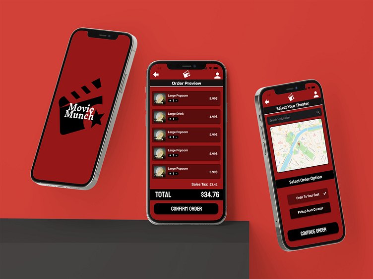
Movie Munch
Introducing: Movie Munch
The ultimate app for an elevated cinematic experience. Movie Munch revolutionizes the way you enjoy food at the movies by letting you order delicious meals directly to your seat, making your film night unforgettable.
My Role: Worked individually to create all aspects of the project.
Primary research on users of the app
Paper and digital wireframes
Digital prototyping in Figma
Creating and executing a research plan
High and low fidelity prototypes
User Personas
When designing our app, I recognized the critical importance of understanding our target audience, so I employed user personas to guide our design process effectively. Then I conducted extensive research to create detailed user profiles, identifying the key demographics, behaviors, and pain points of our potential users. These personas allowed me to empathize with the users, anticipate their needs, and tailor the app's features, interface, and user experience to align with their preferences.
Journey Maps
Journey maps played a pivotal role in the development of this app, providing a holistic view of the user experience from start to finish. By meticulously mapping out the user's interactions, emotions, and pain points at each touchpoint within the app, I gained valuable insights into the user's entire journey. This process allowed me to identify bottlenecks, areas of confusion, and moments of delight for the user to help create an overall better experience.
Paper Wireframes
Creating paper wireframes was a crucial step in the app development process, as it provided a tangible and flexible framework for visualizing ideas and refining the app's layout and flow. These low-fidelity sketches allowed me to quickly iterate on different design concepts, experiment with placement of buttons and elements, and validate initial concepts without getting distracted with the intricate details. They served as a valuable roadmap for the app's development, ensuring the vision aligned with the user's needs and expectations.
Digital Wireframes and Prototypes
Creating digital wireframes and prototyping them was the next step in the app development process. It provided a dynamic and interactive representation of the app's user interface and functionality. This allowed us to test and refine the user experience, uncovering any usability issues and making necessary improvements.
Using these digital protoptypes, I was able to conduct user tests on actual users to gain feedback and implement changes by creating and using a research plan.
Feedback Implementation
Incorporating feedback and insights from user testing, I initiated several enhancements to elevate the app's performance. Upon analyzing the data, a prominent issue emerged – the visual design was lacking, and the home screen layout needed improvement. To address this, I introduced a color palette reminiscent of a movie theater experience. Additionally, I introduced a scroll feature within the deals section, seamlessly integrated into the home screen, allowing users to instantly access the most significant deals upon opening the app.
Reflection
As my inaugural project completed entirely on my own, I can confidently say that I take pride in the final outcome and the work I put in. I continue to refine the final product every day, striving to make it the best it can possibly be.
The plus points of this project were:
Visual design.
The color pallet suited that of a movie theatre app.
Overall user interface. Users stated the flow and usability of the app were very strong.
User Research and Testing. Strong primary research and developmental research allowed positive enhancements based on feedback.


