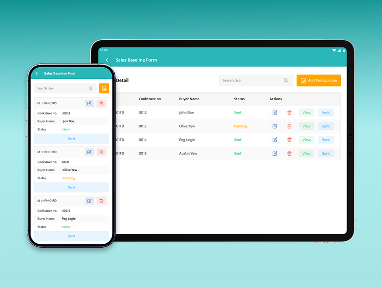
Responsive table design
Designing for Versatility 📱🖥️ Crafting a responsive interface that smoothly shifts from tablet tables to mobile cards for an impeccable user experience. Explore our design strategy to ensure legibility, visual appeal, and touch-friendly interaction. #ResponsiveDesign #MobileUX #AdaptiveUI". Here's a general guideline for achieving this responsive design:
Tablet View
Table View: In the tablet view, when the screen is large enough (landscape or portrait), you can display data in a table format. Utilize responsive tables that adapt to the available screen width. Ensure the table is legible without horizontal scrolling.
Conditional Display: Consider using CSS media queries to conditionally hide or display certain columns or data based on available screen width. Prioritize essential data for this view.
Mobile View
Card Form: When the screen width is narrower (mobile portrait view), switch to a card-based layout for improved mobile usability.
Vertical Stack: Convert each row of your table into a card. Each card should represent a single item or entry from the table. Stack these cards vertically for easy scrolling.
Card Components: Inside each card, you can use various components like headings, images, text, buttons, and icons to represent the data in a visually appealing way.
Touch-friendly: Make sure all interactive elements (buttons, links) are touch-friendly and have enough spacing to prevent accidental taps.
CSS Flexbox or Grid: Use CSS Flexbox or Grid to create a flexible card layout that adapts to different screen sizes.
