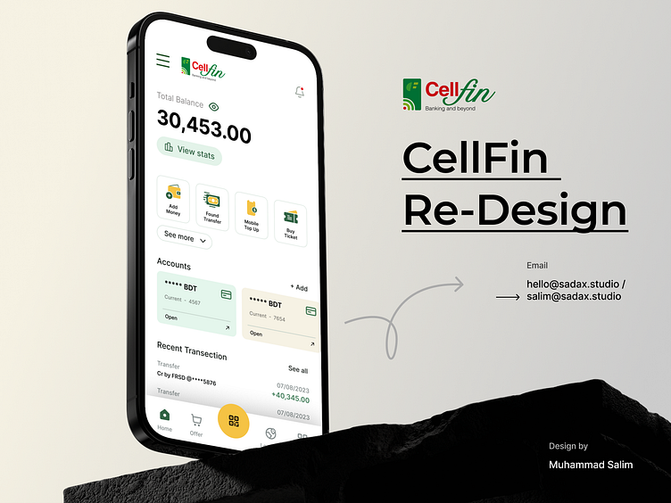
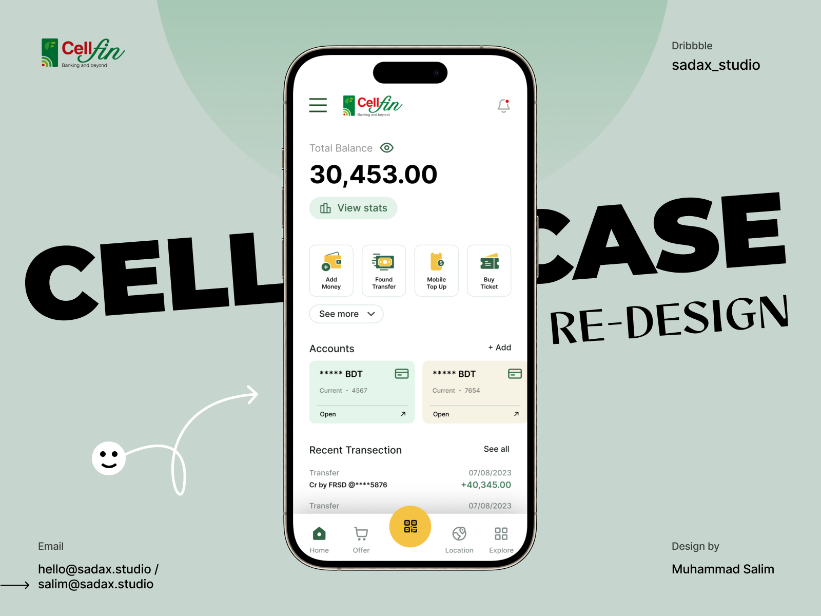
CellFin App Re-Design UI UX
About CellFin
CellFin is a mobile wallet service offered by Islami Bank Bangladesh Limited, one of the prominent financial institutions in Bangladesh. This innovative digital platform empowers users with the convenience of managing their financial transactions and payments directly from their mobile devices. With Cellfin, users can easily make digital payments, transfer funds to friends and family, and even check their account balances and transaction history on the go.
The service places a strong emphasis on security, incorporating features such as PIN and biometric authentication to safeguard user data and funds. Cellfin's versatility extends to supporting bill payments, QR code-based transactions, and integration with other financial services, making it a valuable tool for individuals seeking efficient and accessible financial management solutions in the digital age.
Problem Statement
Using feedback from customers at Cellfin, the feature at Cellfin has a simple appearance, but some UX problem is identified. The menu bar is not easily identifiable, Unusual placement of the log-out icon. The balance option is not user-friendly and does not prioritize more important items. There is an opportunity to enhance the Cellfin feature, offering users a more personalized experience when storing and organizing their items.
Possible Solution
Some solutions found for the CellFin Home problem:
A clear menu bar left the top site on the appShare option put into the profile option.
A clear balance option top on the app using a hide option.
If the user wants to hide the balance option then he can hide the balance option.
More important options are prioritized based on the user's needs.


