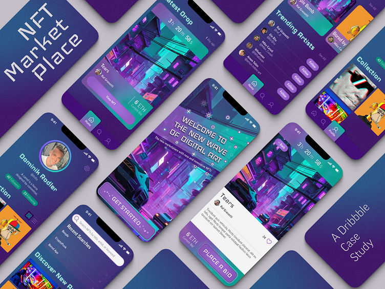
NFT Marketplace Case Study
The Context
This case study was prepared for the Dribbble course, "UI Design 101".
Typically, I emphasize structure, consistency, and intuitiveness in my work. My goal is to design interfaces that are user-friendly, efficient, and enjoyable. Beyond aesthetics, I prioritize scalability and maintainability in both design and code. This exercise presented a deviation from my norm due to its clear focus on aesthetics. Let's see, what we can make of it!
The Brief
Client
Moon, an emerging startup, aspires to revolutionize the NFT marketplace. Their mission is to champion a design-centric approach, ensuring a thoughtfully curated experience for users.
Objective
Craft a unique visual language for this avant-garde NFT marketplace app poised to transform the digital art arena.
Formulate a unified visual aesthetic and seamlessly extend this design across various interfaces, using the provided wireframes and the flow specified by the client.
Support subsequent design initiatives, align stakeholders, and facilitate technical implementation through a UI library and a functional prototype.
Audience
Moon caters to enthusiasts deeply rooted in the NFT and digital art worlds. Predominantly tech-savvy, these individuals are adept at navigating the digital landscape, especially within the realms of cryptocurrency and NFTs. They also have a discerning eye for design and artistic quality. For this demographic, an elegant and visually captivating experience is as crucial as the digital art they create, buy, or trade.
Deliverables
A new visual language tailored to digital art.
High-fidelity designs following the given flow.
A comprehensive Figma UI library.
An interactive Figma prototype.
The Starting Point
The Process
The case study's development went through five stages:
1 - Assemble moodboard
2 - Explore visual direction
3 - Lock and scale design
4 - Craft design system w/ corresponding UI library
5 - Prototype mobile app
Assembling the Moodboard
The challenge was designing a premier NFT marketplace that resonates with "tech-savvy individuals" who have a passion for digital art and a penchant for distinctive digital aesthetics. Given that NFTs and blockchain technology evoke themes of the "futuristic" and "digital", the term "cyberpunk" immediately sprang to mind. Which other art style so vividly encapsulates a dynamic digital future? This ambiance became the cornerstone of my moodboard, which I later translated into a visual language.
Developing the Visual Direction
From there on I started playing around with a cyberpunk-ish image I had generated using starryai and gradually added and tweaked elements until I arrived at a cohesive composition.
The Results
And to wrap it all up, check out the Figma prototype or see it in action below!
The Learnings
Great results are borne from great research and exploration. There is so much incredible work out there from incredibly talented people. You won't find all of the inspiration by just staring hard at your blank screen. To quote Picasso, "Good artists copy; great artists steal." Regardless of whether you consider what you are doing as copying or stealing, note that coming up with everything yourself is not one of the options. The more and better you research, the better your results will be.
Iterate. Iterate. Iterate. And then iterate. I won't lie: developing the design felt intensely bad at times. The elements just didn't gel; the colors were bland; the contrasts were off, etc. But you have to keep on going and trying little tweak after little tweak until you arrive at something that's cohesive and beautiful. Don't expect that to happen at version four. At least for me, it's rather version 86 after which I start being happy with the results.
Subtle details make all the difference. Most elements - in particular backgrounds - almost always look boring in their raw form. It's that barely noticeable gradient, texture, or shadow you add that makes everything come together. It won't be obvious to the viewer at first glance, but try taking it away and you notice that something is clearly missing from your design.
Keep your Figma files clean from the start. Using variables (in addition to atomic design) is key to creating maintainable designs in Figma. Don't add lots of layers unnecessarily. Name your layers properly. Organize your components. Follow atomic design principles and put together your components by combining and extending your atoms. Create styles and variables for everything. Do not make a huge mess thinking "I'll clean that up later". You will get to the point where your file is officially out of control™ much sooner than you think. And at this point, your design is dead, because any improvement just takes too much effort. But don't worry - keeping things clean does not have to be a lot of work. Be smart, adopt good habits, and use cleaner plugins to do the heavy lifting for you.
Keep going, team Figma! The advent of global variables and conditionals has been a huge step forward for designing and prototyping in Figma. As of now, it is still quite limited though. First of all, you cannot apply variables to everything. F.i. you can't define timings for animations as variables. And although you can use one variable as the value of another variable, you cannot use basic mathematic operations for defining sequences of related variables such as defining sizes as default = 8, large = default × 2, huge = default × 4, etc. And of course once you have the ability for conditional logic, you really want to do nesting and sequences. While all of these would be great to have, the Figma team obviously has to start somewhere and I'm confident they'll add these things going forward. The future looks bright :-) Keep going, team Figma!


