Hazuto - Branding Guideline
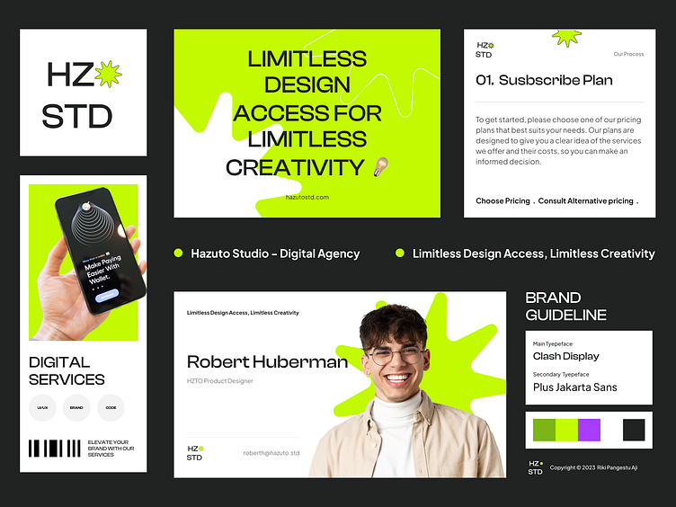
Here is the continuation of my latest exploration and this is Hazuto Studio Brand Guideline.
The guidelines provides the information the way of the logos and the color system and text would be used for the agency branding purposes. For the typeface I use 2 type of typefaces. For headings and subheadings, use the Clash Display font, which exudes a modern and futuristic feel. For body text, use the Plus Jakarta Sans, known for its readability and versatility.
The main brand color is Bitter Lime (#3801FA) that give modern, calming, motivating, and optimistic vibes. I add its analogus color such as purple (A93DFF) and green Dark Lemon Lime (7CB518) to add the landing page contrast and friendly vibes to the landing page.
Hope you guys like it and feel free to leave your feedback!
Thank you✨


