Wells Fargo Mobile Re-Design
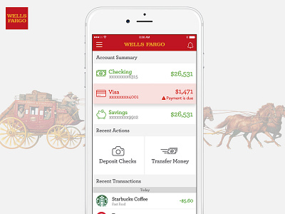
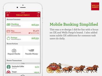
This was a re-design of Wells Fargo Mobile I did for fun. I tried to focus on UX and adhering to Wells Fargo's brand from a typography, color and imagery perspective. I reviewed a lot of their online advertising and discovered Archer is the primary font-family used in their marketing materials.
I also made some UX enhancements to the UI. Things like showing the company logos in the transactions for faster viewing. Shortcuts to deposit mobile checks and transfer money. Alerts for when a payment is due all from the home screen. I will probably be adding more to this project so stay tuned :)
*I still need to add a sticky tab to the bottom of the screen
More by Andrew Dotson View profile
Like


