404 page - Explained !
👋 hey !
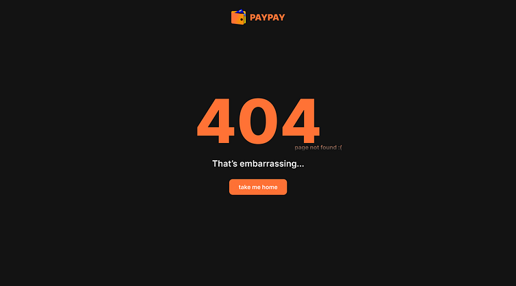
When the visitor click on a broken link and find themselves on a 404 page, it is important to be empathetic and understand that they'll get frustrated finding themselves reaching a dead-end. That's why in this instance I made PAYPAY's 404 page be as simple as it can be.
No navigation bar just a logo to show to the user that they're still on the platform and that they didn't break the internet or their device.
Very big and bold 404 error, with a small but readable error text.
A friendly message acknowledging the issue.
Call to action (CTA) button on the 404 page with a friendly message engaging them to go to a safer place "home".
Only the CTA button is presented on the website, no other buttons that can perplex the user hence why there is no nav menu on the header. Making it a better user experience that keeps the user on the website.
Thank you for your time.
Connect with me on dribbble or via instagram @ui.yassine
