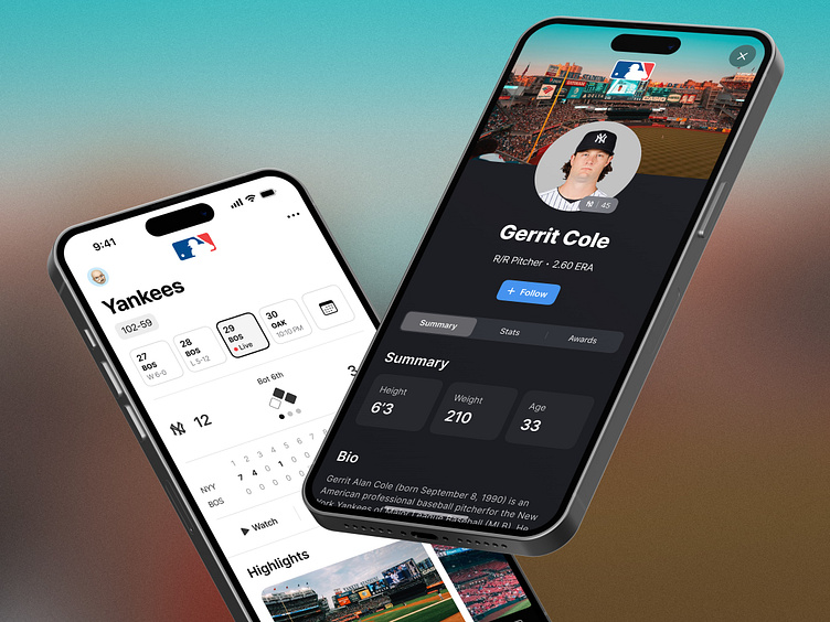
MLB At Bat redesign
MLB at bat redesign
As an avid baseball fan, I frequent the MLB At Bat app often during the regular season and offseason. One evening, while checking the latest Hot Stove news for the off-season back in 2020 and more recently this year, I was thinking as great as this experience is for a baseball fan, it is clearly in need of a face lift.
Yankee stadium photo from Flow Flo: https://unsplash.com/photos/pXLWiickGlQ
Improved scores and home screens
The current score page is hard to scan. This new improved layout breaks out each game into a card layout that's easy to parse and dig deeper. A simplified Home Screen brings a larger scorecard to the main screen.
Improved player profiles
The current player profiles are pretty bleak and not very engaging. I reimagined the stats and bio in a card based layout to allow the data to be easily scanned with minimal horizontal scrolling.


