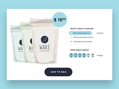
Wake UP Product Card
Hi dribbblers,
My e-commerce journey continues. This time, it is a coffee shop.
As for me, one of the obstacles to the final purchase in e-commerce is a dropdown that demands too many efforts. To be honest, as a user I hate them.
So here is my version of a product card with no dropdowns or inputs.
User can quickly scan the flavour choices. Another novelty is a way how to choose a quantity of coffee bags, it suppose to work as a rating - you are clicking on serial bag icon and the chosen range will be highlighted with blue circles. This way is even more engaging than just input with numbers.
And what about you? What is your the most hated UI element?
More by Olia Gozha View profile
Like
