WorkOS - Dashboard Redesign
Hello everyone!
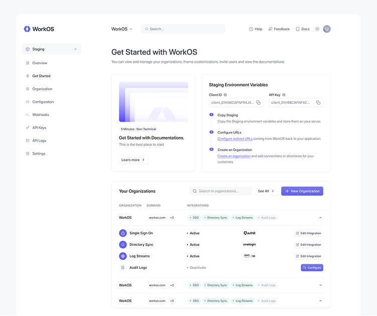
Check out the sleek and visually stunning dashboard design I meticulously crafted for WorkOS. It was an exhilarating journey to bring this vision to life, combining elegant aesthetics with intuitive functionality. Every pixel has been thoughtfully placed, ensuring a seamless user experience.
The clean layout allows users to effortlessly navigate through various features and access critical information at their fingertips. The carefully chosen color palette not only enhances visual appeal but also promotes clarity in data visualization, making it easier than ever before to understand complex analytics.
From designing captivating charts that provide insightful data representations to implementing interactive elements that foster engagement, every aspect of this dashboard aims to elevate productivity while delivering an enjoyable user interface. We wanted each interaction within the platform feel like a delightful breeze amidst your daily workflow.
Now comes the exciting part - we can't wait to hear all your valuable feedback! Your input is invaluable as we continue refining our designs based on real-world usage scenarios and industry best practices—ensuring you have nothing short of an exceptional experience working with WorkOS's cutting-edge tools.
If you're loving it, smash that "L" key. ❤️ I can't wait to hear your comments and feedback. Thank you in advance!
Components
You can see larger and more detailed components.

