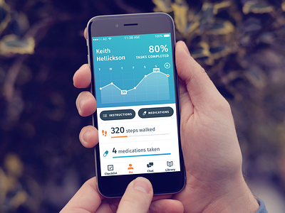
Patient Progress Profile
Our app just passed review in the App store, and we're expecting a release on Tuesday! It's been a wild ride these last few months completely refactoring the app, from both a design and a development point of view. I'm super grateful to both of my mobile teams for busting all of this work out so weekly!
Challenges faced:
The Wellframe app is targeted towards people with critical conditions, like heart disease or diabetes. Many of our users are new to using apps, so UX has been paramount in our design sprints. Legibility is also important for an older audience, so my challenge was to balance type readability with visual aesthetics.
More by Wellframe View profile
Like

