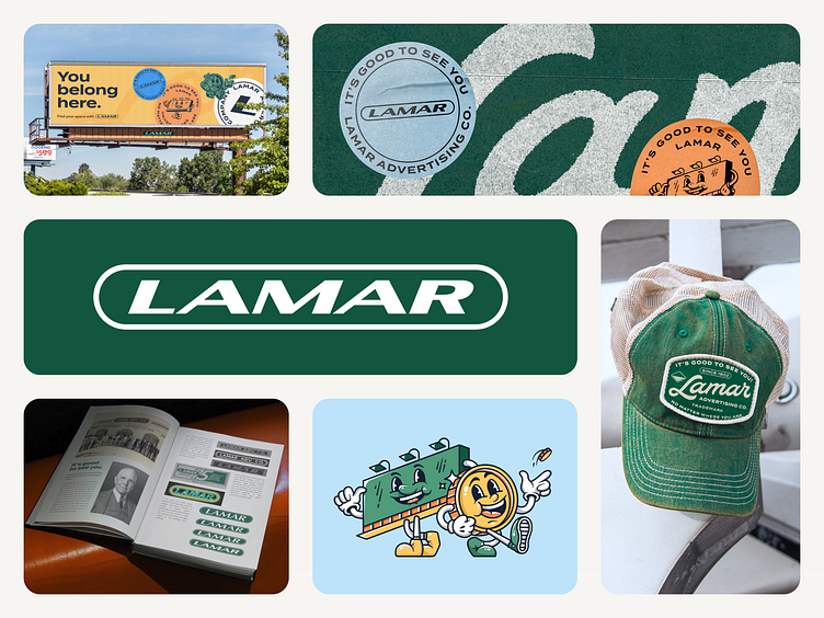
Lamar Advertising® Brand Refresh
So stoked to finally share a glimpse of the extensive work we undertook for Lamar! Teaming up with my friend Gabe, we took on the task of revitalizing Lamar's century-old brand. With Jordan Jenkins leading the way, our team thoroughly enjoyed every moment of this endeavor. Additionally, we were fortunate to have the incredible illustrations of Courtney Askew and Vic incorporated into the project!
Our journey began with a deep dive into Lamar Advertising’s rich history. The insights we unearthed at this stage formed the foundation of our approach, allowing us to create an authentic solution that both honored Lamar's identity and paid homage to its legacy.
We established a foundational grid to ensure the precise alignment of Lamar's mark. As an added touch of purposefulness, we applied a 21° horizontal skew to the wordmark, subtly nodding to Lamar’s founding year (19+02 = 21). This skew maintained the iconic essence of their logo while enhancing its recognizability. This geometric refinement was crucial in guaranteeing a seamless translation across diverse media and sizes, all while upholding Lamar's enduring reputation.
There's so much more to unveil, but for now, please enjoy this small collage showcasing some of our work! Thank you immensely for taking the time to explore. Feel free to share your comments, love, appreciation, and feedback.
✌️Do you have a project in mind? We'd love to hear about it. Get in touch with us at http://heyo.is/excited-to-chat
