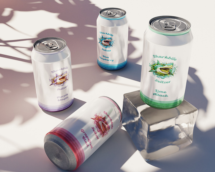
SHARKBITE SELTZER - branding and package design
Logo Concept for SharkBite Seltzer
The logo for SharkBite Seltzer is a striking fusion of playfulness, youthfulness, and minimalistic design, capturing the essence of this adventurous brand.
Design
The central element of the logo is a bold vector illustration of a powerful shark in mid-attack, rendered with clean lines and sharp angles. The shark's ferocious yet playful expression embodies the spirit of SharkBite Seltzer - exciting, energetic, and full of life.
Color Palette
The color palette draws inspiration from the ocean, with deep sea blues, vibrant aqua greens, colorful flora and crisp white accents. These colors evoke the refreshing and invigorating nature of seltzer while also connecting with the brand's aquatic theme.
The SharkBite Seltzer delivers a punch of excitement and playfulness. It targets a young and adventurous audience while maintaining a clean and minimalistic design that ensures versatility and recognition. This logo serves as a powerful and memorable symbol for a brand that's all about having a thrilling and refreshing seltzer experience.


