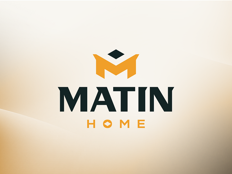
Matin Home - Tiles & Sanitary Co.
In designing the logo for Matin Home, I began with a vision of blending the brand's initial with its core offering—tiles. The brand symbol creatively fuses the letter 'M' with an isometric tile shape, set at a dynamic 30° angle.
For the company name 'MATIN', I chose a sleek, modern font and then made modifications to ensure it uniquely represented the brand's character. Using a grid-based approach, I structured each letter within subdivided blocks, emphasizing precision and consistency. Just below, the word 'HOME' is carefully aligned, with the 'O' echoing the isometric design of the brand symbol, tying everything together seamlessly.
Leveraging the vibrant "Matin Yellow" and it's contrasting partner "Matin Dark Aqua" as primary shades, alongside a harmonious array of secondary colors, I've crafted a palette that embodies the brand's ethos. Combined with the tailored font, it captures the essence of Matin Home, epitomizing its dedication to quality and elegance in the home products domain.

