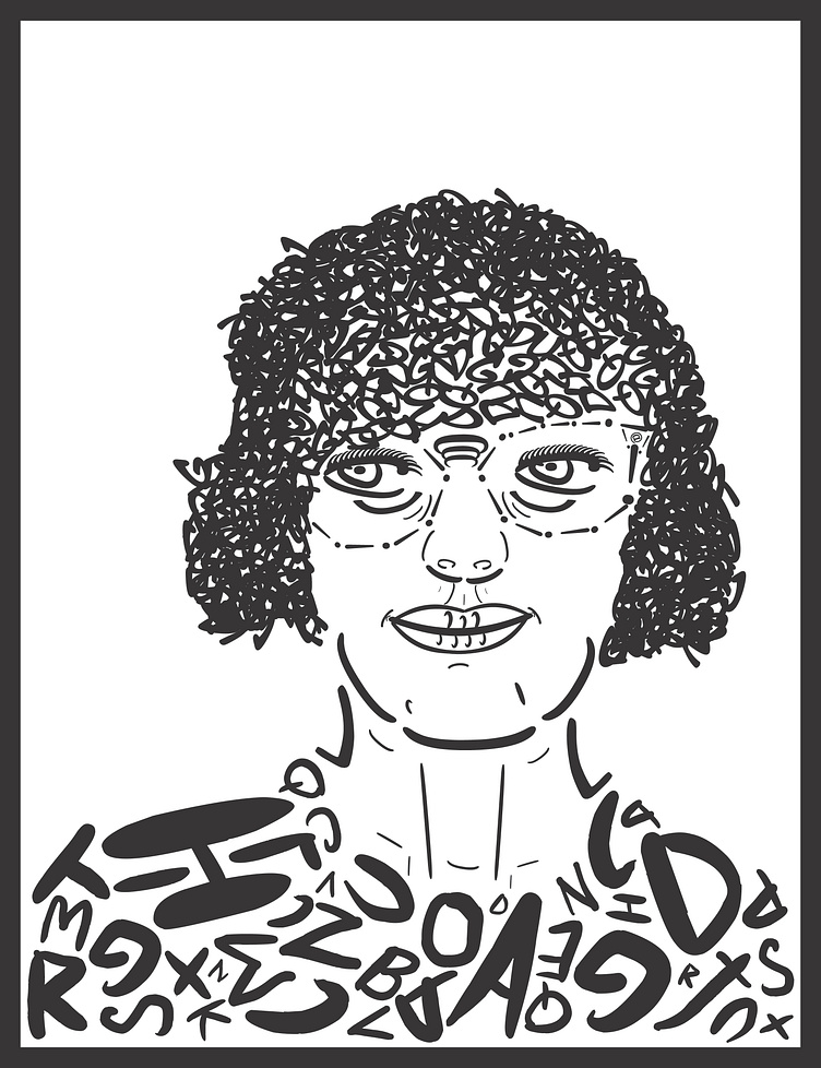
Type Portrait
This was a project made for us to portray ourselves using only type with a maximum of 2 fonts. I primarily used forms on minus and dashes in the face with a little more liberty in certain arias such as the glasses. I used thicker marker-like fonts because I think the playful nature of it fits me. My shirt was made of a small collage of the alphabet in my first font. My hair was my biggest commitment in this project with me using various curved, circular letters from my second font overlapped to give it a shading effect. The original image was front lit so the front of my hair is brighter, it gets more condensed and darker closer to the edges. This shows an extra level to my portrait instead of only focusing on getting the general figure.
More by Andrew View profile
Like
