A Beautiful You Medical Spa - Web Design
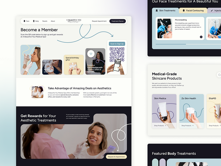
Our goal for A Beautiful You Medical Spa was to design a site that was eye-catching and playful. But it was also important to us that the site didn't feel derivative of anything a user might have seen before.
We also wanted to ensure that navigating the site was simple and intuitive. The arrows guide the users eye to all important CTAs. The tabular content organization allows the user to see high level information without having to sort through overwhelming blocks of content.
The rounded card design keeps information clean and friendly. As a whole, the site delivers information in a way that is organized but never sterile. It's fun but never cluttered.
Made with 💜 in Kansas City
Website / Get a Quote / Instagram / Clutch
More by Lifted Logic View profile
Like
