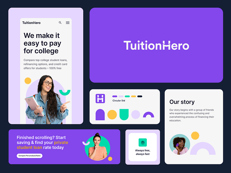
TuitionHero – Visual language
TuitionHero is a student-centric online marketplace for financial aid. It makes it fast and easy to compare and choose student loans and refinancing options.
🌟The challenge
Our goal was to create a strong branding concept that would strike a balance between students and the financial industry. Then, on this basis, develop a comprehensive design system and a library of components that will allow us to efficiently manage the project on many websites.
The TuitionHero logo has been carefully prepared and thought out in terms of branding. It was created with a geometric typeface that corresponds to the shape of the brand. The logo is rich in metaphors, in the letter H you can see a bridge (connecting students with universities) a hug (support from TH) and a smile.
We chose vibrant purple, green, and orange for the color palette to convey friendliness and energy. Solid colors and geometrical typography in headlines create a professional yet energetic look, what is essential in the financial industry. This visual style defines our brand as friendly, inclusive, and engaging, making it perfect for students.
In TuitionHero everything starts with an opportunity. We defined 5 geometrical shapes and each of them is meaningful and depended on the other. The most essential one is a shape that reflects the gate and symbolizes opening up for greater future opportunities. Having such opportunities it's easier to earn achievements (badge), provide security (circle) and pursue dreams (star).
📈Results
We designed an fresh and energetic branding and Design System with +100 components that allowed us to be unique, original and consistent on over 40 subpages, driving the brand's success.
Product Design: Oskar Tomecki, Monika Fedko
Do you like our work? We’re available for new projects!
Tell us more at hello@10clouds.com


