self care |app design

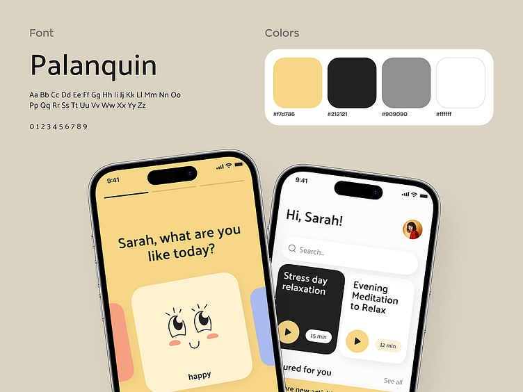
The home screen of the app is designed to be intuitive and engaging. It prominently displays a variety of meditation options, organized for easy navigation and selection. This allows users to seamlessly access the meditations that resonate with them, enhancing the overall experience and encouraging regular practice.

Additionally, the app features a profile page with an emotions chart, providing personalized insights. The emotions chart visually represents the user's mental state over time, enabling them to track patterns and gain a deeper understanding of their emotional well-being. This feature empowers users to track their progress and make informed decisions about their mental health.
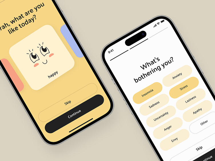
To create a warm and uplifting ambiance, we have opted for a light theme with a yellow accent color. Yellow is associated with warmth and positivity, triggering feelings of comfort and optimism. The color scheme, along with friendly illustrations, aims to create an inviting and soothing environment within the app.