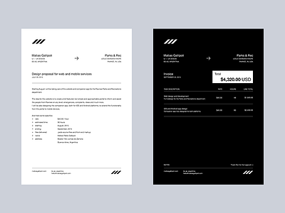
Head letter and invoice take 4
hey guys, this is the 4th take on my branding stuff, i went for something deadly minimal to match my current portfolio, of course, its based off my previous set.
What do u think?
More by Matias Gallipoli View profile
Like

