Parking App Design Concept
💌 Have a mobile app idea? We are available for new projects!
hello@ronasit.com | Telegram | WhatsApp | Website
Our design team has successfully created the UI/UX design for a parking space booking concept. Let's dive into its key features together!
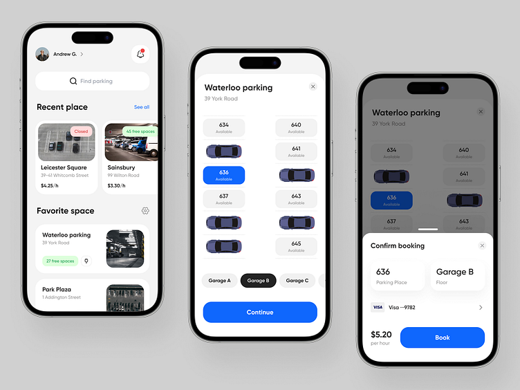
The application opens up to the main screen featuring various functional areas. The most prominent is the search facility which allows users to look for available parking spaces in real-time. This screen also displays recently booked parking spaces as well as favorite places for easy future access.
The workflow of the app leads the user to the parking space selection screen upon finding the desired location or selecting from recent or favorite places. This screen provides explicit details regarding the chosen parking space.
Completing the space selection, the user navigates to the booking confirmation screen. This screen confirms the booking details and awaits the user's final confirmation.
The design team decided to go for a light theme as a backdrop, accentuating key user interface elements with stark tones of blue and black. This helps in forming an intuitive interface where vital components of the design are highlighted, creating a clean and streamlined UI.


