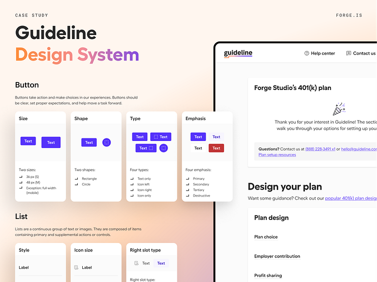
Guideline Design System component design guidelines
In 2020, Guideline was rebranding and needed a design system to unify its visual language across its growing product offerings.
After reaching our initial draft of our design tokens "style guide," we focused on the lists of components we gathered during our audit and prioritized them based on usage—giving extra weight to components that are most frequently used and combined with other components to create larger and more complex components—and expanded our work from there.
We wrote and designed the guidelines to live inside Figma to lessen the disconnect between designers, where they work, and guidelines that help them solve problems.
View the case study at https://buff.ly/3ZDbAoi
More by Forge Studio View profile
Like
