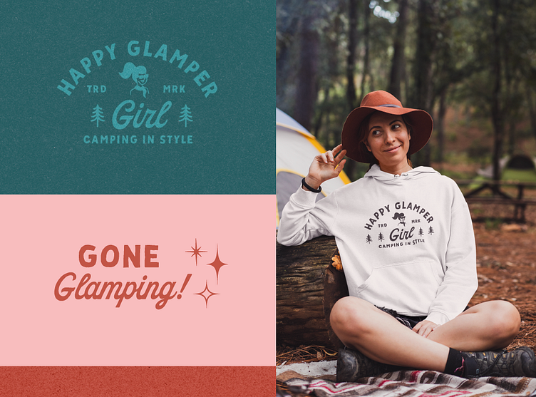
Happy Glamper Girl – Color Exploration
Client: Happy Glamper Girl
I loved hunting for the perfect nostalgic fonts that would feel both rugged and glamorous and then tweaking them to fit the needs of the client. These two fit the bill. The contrast between the hand-drawn sans serif font shows the two sides of the target audience– aka women who want to enjoy the outdoors with fun, nostalgic accessories. The sans-serif font represents the outdoorsy side of the brand and the script font represents the unapologetically pampered side.
For any typography-driven product designs, we used the sans-serif font as the default typeface and sprinkled in the "glam" script font for any words that hinted at the luxurious "glamping" personality of the brand.
For more details about this project: https://joannagoebel.com/project-happy-glamper-girl/
