Chat GPT Redesign: AI Chat Interactions
Chat GPT is awesome. But how could we make it better? This redesign answers that exact question. Specifically, I used three key UX principles, Jakob’s Law (Law of Familiarity), The Aesthetic-Usability Effect, and Improving Visual Hierarchy to decrease cognitive load (aka don't make people think too hard).
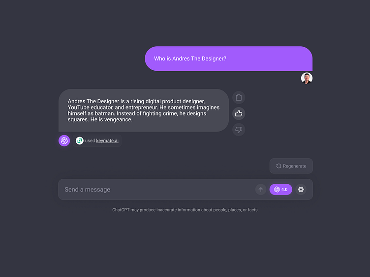
I wanted to provide a more familiar messaging experience. So I followed some common design patterns of other messaging platforms like iMessage, Instagram, etc... This included message bubbles, directional arrow icons, and a more visually friendly user interface.

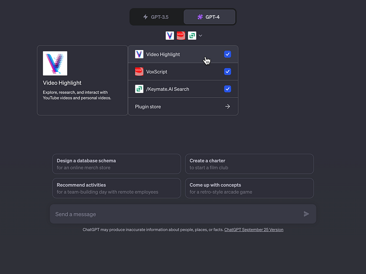
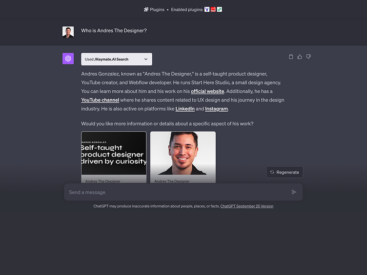
The original design (slide 2) had UI elements scattered everywhere. So I improved the visual hierarchy and consolidated menu items within the message input bar. Additionally, when selected, other UI elements like the "try something new" options have reduced opacity.
Connect with me on LinkedIn and X (formerly twitter)
Want this Figma prototype template & tutorial? If I get 400 email sign ups, then I'll give it away for free :) Sign Up Here
