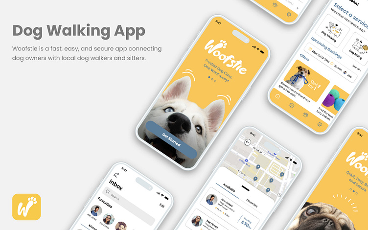
Dog Walking App
Overview
Approximately 65.1 million U.S. households, with a majority being working-class individuals, own dogs and often struggle to find fast, convenient, and accessible dog care services nearby.
Value Proposition
Woofstie is an app that connects dog owners with trusted local dog care providers, ensuring a stress-free, speedy, and secure process for peace of mind.
Identifying Problems
Many apps frustrate users with lengthy registration and service search processes in today's fast-paced world.
Certain apps lack clarity, leading to apprehension and reluctance in their use.
Some apps have cluttered and unappealing UI designs.
Certain apps lack features that offer users a sense of confidence and security.
Identifying Solutions
Prioritize simplicity and efficiency in registration and service search.
Create a user-centered design, tailored through quantitative and qualitative research with a clean and user-friendly interface.
Efficiently showcase relevant information for easy viewing.
Implement features that will give the user reassurance.
Market Research
I began by researching the competition to understand how similar apps address issues, particularly Rover and Wag, the most popular ones in the market. Several user survey responses quantified customer needs, and one-on-one interviews helped uncover specific app-related challenges.
Findings
Dog Owner Perspective
Users have conveyed satisfaction with the apps, although a significant proportion have also expressed frustration with searching and scheduling processes and functionalities.
Users discovered that certain apps look cluttered and feature functionalities that are confusing and unnecessary.
Concerns varied, from not understanding what's paid for to a desire for better optimization.
Dog Walker/Sitter Perspective
Users find it difficult to personalize their rates based on special needs.
Users have had many issues with some apps not showing accurate times of service provided.
Users have also discovered that certain apps look cluttered and feature functionalities that are confusing and unnecessary.
Users have expressed concerns about certain apps lacking an effective messaging platform, which has resulted in a loss of business for them.
Approaching User-Centered Design
While it may seem that everyone is interested in saving money and time, user research revealed diverse motivations. Creating personas clarified these differences, serving as vital reference points during feature development.
User Personas
In the research and design phase, I primarily focused on two personas, each highlighting essential functions: utilizing the app's browsing, searching, and filtering for exploration and creating personalized features for user control and customization.
Creating Structure
User Flows
In order to create an app that serves both dog owners and dog sitters/walkers, I meticulously crafted the user flow to offer a seamless and intuitive navigation experience.
The following was taken into account:
Onboarding and registration.
Management (Creating profiles and managing information)
Search-related functions (Browsing, filtering, finding, and booking)
Messaging functionalities.
Wireframes
To visualize a user-centric experience, quick sketching helped me identify common design patterns in competitive apps, ensuring familiarity when implementing them in Woofstie. It also pinpointed versatile screen types and intuitive swipe/touch gestures.
Low-Fidelity Wireframes
After completing my initial sketches, the process of translating them into low-fidelity wireframes not only aided in establishing a more organized and coherent structure but also enabled me to define a comprehensive flow.
Visual Design
Establishing a tone of voice
Woofstie is essentially an app that caters to dog lovers. Whether you own one or want to take care of one, dogs are the main inspiration for the overall look and feel. I wanted to explore vibrant colors and visuals that exude an energetic/joyful atmosphere. When it comes to visuals, my aim is to present imagery and iconography that capture the essence of happy and healthy dogs, leaving users with a sense of trustworthiness about the app and the services it provides.
Moodboard
This board captures the lively and joyful essence of dogs, igniting inspiration for the overarching visual design.
Visual Components
The overall look and feel exude a welcoming and comforting personality, characterized by vibrant colors harmoniously intertwined with a sleek and user-friendly interface, all with the goal of captivating the eye.
Design System and UI Kit
High-Fidelity Mockups
Main Features
High-Fidelity Prototypes
Onboarding
Fast, easy, and hassle-free.
Dog Walker Search
Seamless as 1, 2, 3 (Search, Find, Connect)
Messaging and Booking Management Features
Instantly Accessible, Easily Trackable
Usability and Testing
During this process, I collected important insights to enhance the user experience, resulting in a more user-friendly interface. The following improvements were made:
Improved visibility of key elements like call-to-action buttons and font size for better readability and user interaction.
Streamlined the dog walker and sitter search process, ensuring accurate availability info before booking.
Simplified registration into a single scrollable screen, eliminating navigation hassles.
Added a home screen feature to display upcoming service bookings as reminders and for live tracking.
Integrated incentives and concise, valuable content to keep users informed and engaged without overwhelming the app.
Takeaways
It all boils down to understanding the user's needs and their interaction with the product, which is always an evolving process. Also, striking the perfect balance between aesthetics and functionality is key in designing and developing a successful product.


