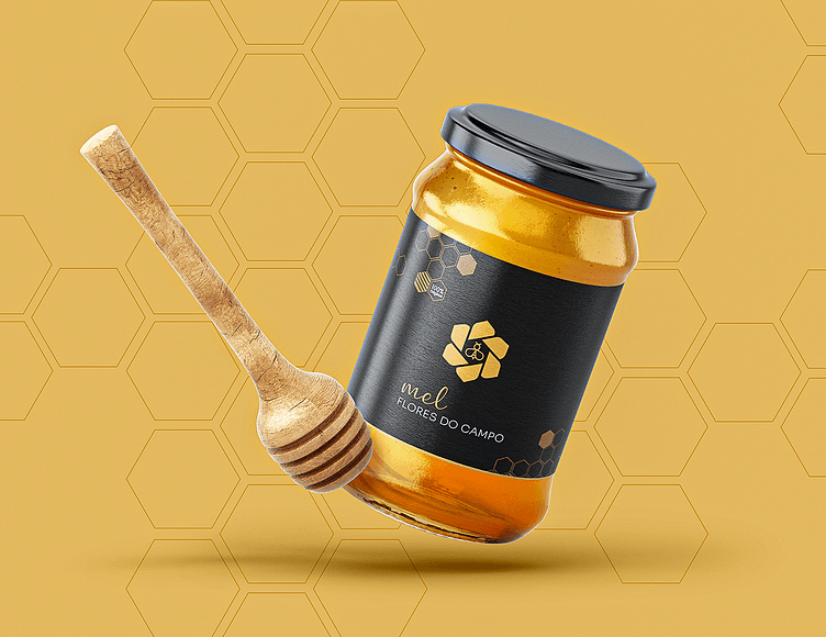
Logo Design Honey Company
About the Brand
MEL FLORES DO CAMPO
"We deconstruct paradigms and reinvent traditions."
Based on a detailed briefing, I developed the new visual identity of the Mel Flores do Campo brand, capturing the most striking and distinctive elements of the business and incorporating the owner's personal touch. As with any brand, it was crucial to establish a connection with the target audience.
The brand is dedicated to the production and sale of high-quality natural honey from Portugal, more specifically from the Alentejo region. The main idea of the brand is to offer a high standard product at an affordable price. In this sense and taking into account the premium quality of the product, the Visual Identity was developed based on a clean, minimalist and premium pattern, standing out with a sophisticated logo and striking colors.
The logo concept originated from elements that reference the brand name and the product itself.
About the Product:
On the slopes of Serra D'Ossa, the honey with a unique flavor and texture
Respect for nature is a passion passed down from generation to generation, give this honey a superior quality.


