CareerGuide.com Redesign Case Study
Challenge:
CareerGuide.com is a website that provides career guidance and counseling services to students and job seekers. The website was outdated and difficult to navigate. It was also not responsive, meaning that it did not display well on mobile devices. This was the previous website (https://www.careerguide.com/).
The client wanted a new website that was modern, user-friendly, and responsive. They also wanted a website that would accurately reflect their brand and values.
Solution:
I started by conducting a user research study to understand the needs and pain points of CareerGuide's target audience. Based on the research, I developed a new information architecture for the website that made it easier for users to find the information they were looking for. I also created a new design that was modern and visually appealing. I also made sure that the website would be responsive in the future so that it could be used on all devices.
Design Decisions:
Many design decisions are made in the process of redesigning this website. Here are a few of the most important decisions:
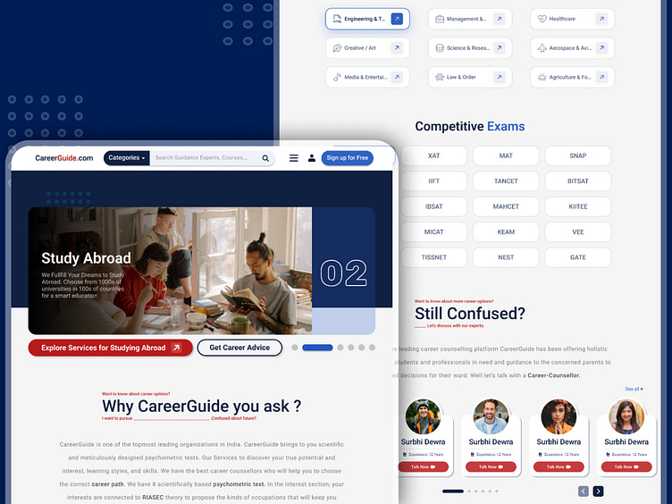
Hero Section: To convey the value of CareerGuide's services, I chose to use a hero section at the top of the homepage. I also decided to use a clear and concise message in the hero section and to include the "Get Career Advice" button.
Career Services Section: The previous Career Services section is all over the place. I made the decision to start over and rebuild this section. I used tags to separate different categories within career services and created a horizontal carousel design that is pleasing to the eye and allows us to quickly find what we require.
Still Confused About Your Career? Section: I decided to create a "Still Confused About Your Career?" section on the homepage to engage users and encourage them to learn more about CareerGuide's services, and I gave them the option to talk to our career experts if they were confused. I used the text "Still Confused About Your Career?" to resonate with many users.
Wireframes:
One of a design's most crucial components are the wireframes. I already discussed most of the design decisions that are made possible because of the wireframe. Here are the wireframes:
Okay, enough with the dull wireframes. Let us get right to the point and explain why I chose the specific color and font for this website.
Colors:
The primary color of the website is blue (hex code: #3263C3). Blue is a calming and trustworthy color, which is important for a website that provides career guidance and counseling services. It is also a modern color that is well-suited for a website with a clean and professional design.
The secondary color of the website is dark red (hex code: #B81D1D). Dark red is a bold and passionate color, which is relevant to CareerGuide.com's target audience of students and job seekers who are passionate about their careers. It is also a complementary color to blue, which helps to make the primary color stand out.
The background and mostly used text color is Dark Blue (hex code: #10203F). Dark blue is often associated with intelligence, trust, and professionalism. It is also a calming color, which can be helpful for users who are seeking career guidance and counseling. The dark blue color creates a sense of sophistication and authority, which is appropriate for a website that provides career guidance and counseling services.
The accent color of the website is white (hex code: #F5F5F5). White is a clean and neutral color that helps to make the other colors on the website stand out. It is also associated with new beginnings and potential, which is relevant to CareerGuide.com's mission of helping people achieve their career goals.
Typography:
The font used on the CareerGuide.com website is Roboto. Roboto is a sans-serif font that is known for its readability and versatility. It is also a modern font that is consistent with the overall design of the website. The Roboto font is used consistently throughout the website, which helps to create a sense of unity and cohesion.The font size is large enough to be easily readable, but not so large that it is overwhelming. The line spacing is generous, which also makes the text easy to read.
Conclusion:
The new CareerGuide.com website is a huge improvement over the old website. It is now modern, user-friendly, and responsive.
The new career services section makes it easier for users to find the information they need about CareerGuide's services.
The new "Still Confused About Your Career?" section of CareerGuide engages users and encourages them to learn more about the services offered by CareerGuide. It also builds trust and credibility with users by allowing students to interact with career experts.
The new color palette and typography are both modern and professional, creating a calming and inviting atmosphere.
The new content is comprehensive and easy to navigate, with a focus on communicating the value proposition of CareerGuide's services.
The new user experience is excellent, with a focus on making it easy for users to find the information they need.


