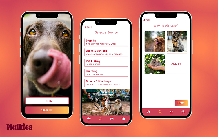
Walkies: For Dogs and Dog Lovers alike
Goal
Make a dog walking app that is both lovely and simple to use, while also learning to use Figma. The goal is to create a way for dog owners to connect with trusted service providers who can help them care for their pet.
Scope
Create an on-boarding flow and a search flow: a minimum of 6 screens.
Role
Product Designer
Prototype
Get right to the good stuff and try out the prototype, then come back and see the progression of my design.
Personas
Two potential users of the Walkies service
Moodboards
An early moodboard shown above has bright pops of color along with monochromatic backgrounds that I would try to recreate in early versions of my dog walking app. The image below shows the progression of a single screen as my design developed and moved away from the the original moodboard.
User Flow: On-boarding
Wireframes
I started with hand drawn wireframes and started to replicate them in Figma. By drawing them by hand I can move fast and get my ideas out quickly. Once I had them on paper I could take my time learning to use the shapes, measurement tools and keyboard shortcuts.
This is a great exercise for getting comfortable with Figma and all of the available tools, including setting up a layout grid, which I clearly did not use in these frames. Later frames would be set up on an 8 pixel grid with 2 columns.
UI Kit
Prototype
Final Thoughts
By doing this case study I learned a lot more than just Figma. I enjoy playing with color and I know that is my strong suit. I learned a lot about selecting typography that aligns with the tone of the project and also contributes to the visual hierarchy. I learned how not to use Auto Layout and when to properly use it.


