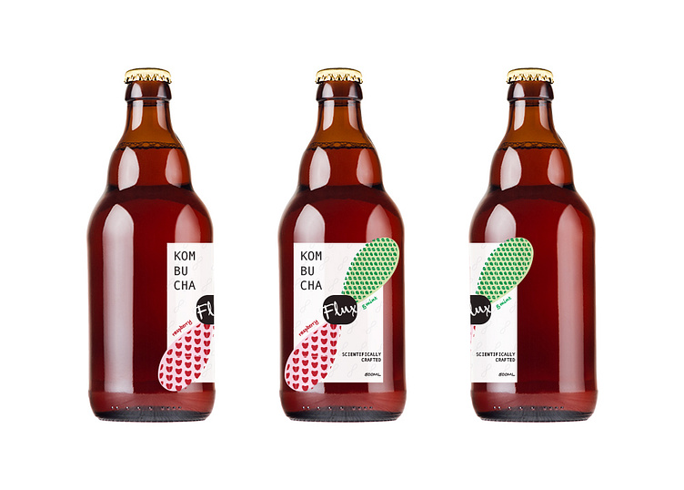
"Flux" Kombucha Label
The brief was to create 2 options for the new Kombucha brink brand "Flux". the design should be on trend and highlight the all natural product with smart and effective packaging that incorporates a strong design aesthetic. The clients also wanted to incorporate both a die cut and spot uv embellishment on the label to really help the design stand out from competitors. See below for my research, process and the final result.
Of the two labels I proposed, the preference was the second option as this design stands out from the crowd of health drinks with a scientific look and feel. The design incorporates the infinity sign, which works well with the tagline of "scientifically crafted" and is fun yet simple; the use of whit area is a point of different in the oversaturated kombucha market.


