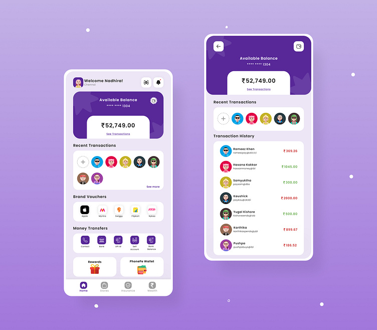
PhonePe Redesign
One design problem I found out while using PhonePe was there was no recent transaction list on the main page and its existence can save a tad bit of time for users with the same set of receivers. Also adding the balance of the primary account at the top provide assurance to users that they are having enough money in their account before making a transaction.
More by Nadhira Ishrath View profile
Like
