Revamping Government-Focused E-commerce
Project Overview
The focus of the project was a government-focused marketplace operated by a reverse logistics company. The objective was to migrate and overhaul the marketplace, set up a beta site, and leverage this beta duration for enhanced user testing, smart technology integrations, and SEO improvements.
The Product/Service
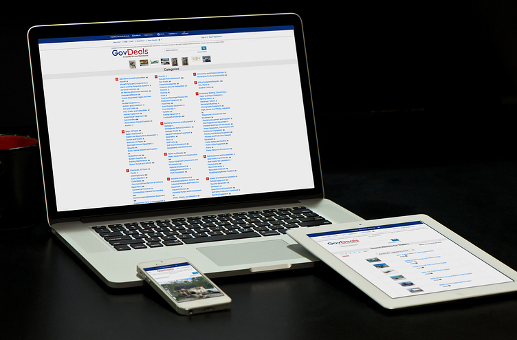
The service in focus is a government-focused e-commerce marketplace for a reverse logistics company. This platform is designed to serve as a bridge between government institutions and the general public, streamlining the purchasing process and ensuring efficient, secure transactions. Given its unique user base, the platform has to cater to both tech-savvy and non-tech users, ensuring all users can navigate and use the platform with ease.
Core Problem
After analyzing user reviews through Userlytics, Customer Service reports, and HubSpot Surveys. There were mentions of slow loading times, difficulties in finding products, and challenges in navigating the platform. While the company was aware of the challenges, the user feedback highlighted the urgent need for a user-centric overhaul.
The Goal
The primary objective is to create an intuitive, efficient, and enjoyable platform that resonates with the user's needs while leveraging the latest technology and design principles. This would mean completely overhauling the current system, setting up a beta site, and rigorously testing it to ensure all pain points are addressed.
My Role
As the Lead UI Designer, I was at the forefront of this transformation, working alongside the UX Researcher. My role included understanding user behavior, analyzing feedback, ideating, creating wireframes and mockups, and working hand in hand with the development teams to ensure smooth execution.
Responsibility
Given my designation, it was my prime responsibility to ensure the new platform was user-centric. I had to dive deep into user analytics, conduct interviews, and run usability tests. Collaborating with developers, I had to ensure that the designs were feasible and met both user needs and technological capabilities.
Project duration
Considering the scale and complexity of the project, especially with the migration, a timeframe of 12+ months was anticipated. This duration factors in research, design, development, testing, and launching of the beta site.
User Findings
The user base's primary needs include finding affordable items, easy navigation, fast loading times, secure transactions, and an intuitive search mechanism.
Problem Statements and User Journey

Overview of Journey Findings:
Discovery: Users often came through referrals or direct links.
Onboarding: New users found the sign-up process tedious.
Navigation: The existing UI made it difficult for users to find what they were looking for.
Search and Discover: Inefficient search meant users couldn't find products easily.
Transaction: Bugs sometimes interrupt the purchasing process.
UX Structure
The revamped platform has a clear, hierarchical structure. The homepage focuses on discovery, with a powerful search bar. Product categories are organized more intuitively, and product pages have been enhanced with better imagery and clearer descriptions. The transaction process has been simplified.
Learnings

Beta Impact:
Thus far, user feedback has been overwhelmingly positive, highlighting the improved UI and efficient search mechanism.
Beta Learnings:
Never underestimate the impact of a user-centric design.
Collaboration between designers and developers is key for successful implementation.
Continuous user feedback, even post-implementation, is invaluable.
Addressing user pain points directly impacts the bottom line.
