Comparison site Landing page concept | Finder.com

Comparison sites can be confusing...
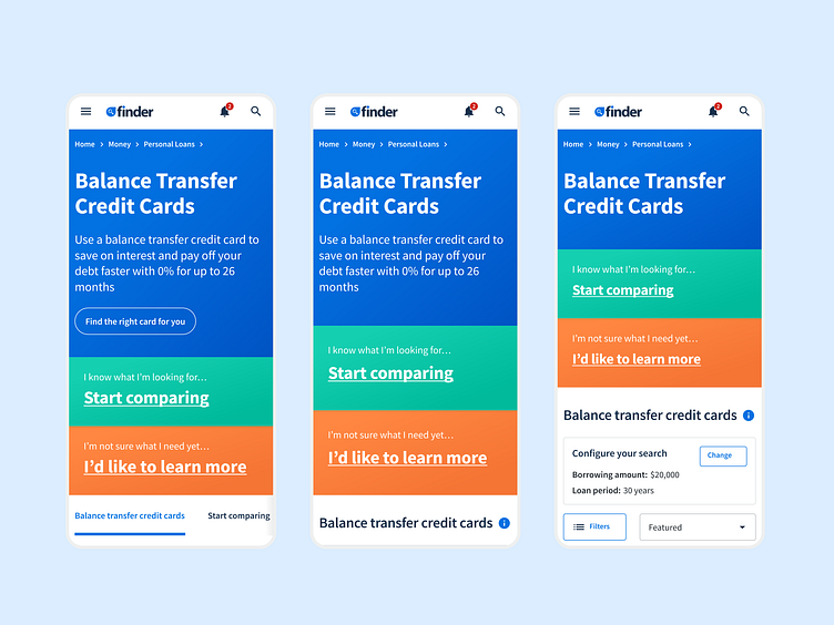
So we thought we'd transform the traditional Hero section into 3 large blocks of colour with large CTAs giving users 3 clear directions to take as soon as they land on the page. All of this while ensuring we maintained Finder's best-in-class SEO performance 😏
Keen to hear your thoughts!
Feel free to feedback and comment. Don't forget to press "L" if love it. Thanks!
-------------------
GoDesignGo offers unlimited UX/UI design as a subscription for Startups.
🤙 Work With Us: hello@godesigngo.co | godesigngo.co