Bristles of Change: A Bold Transformation of "Oral B" Logo
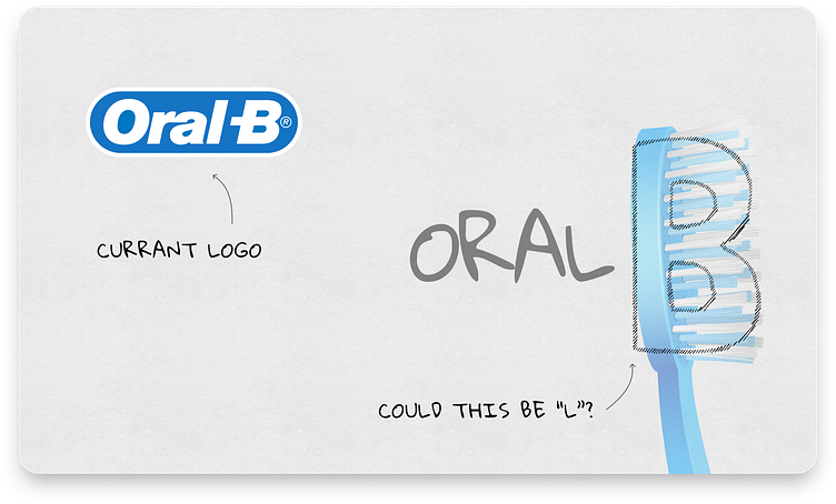
📖 Into: One morning, while brushing my teeth with an Oral B toothbrush, I couldn't help but notice the logo's subtle curves and the familiar "B" staring back at me. It felt like an old friend, but it also begged the question: Could it embrace a bolder, more precise design while staying true to its dental roots?
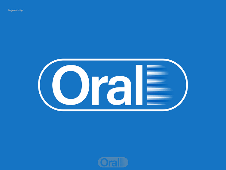
💡 My Approach: Inspired by the precision of dental care, I set out to reimagine the Oral B logo. The goal was clear – create a logo that captures the essence of dental health with straight, symmetrical lines. The "B" became a canvas for innovation, evolving into bristles that symbolize oral care's core principles.
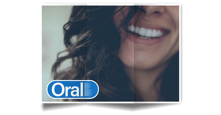
🌟 The Result: Fast forward, and the reborn Oral B logo now stands as a testament to dental precision. The bristles represent the heart of oral health, and the logo's straight lines and symmetry mirror the precision of dental care.
🔍 The Devil in the Details: Just as dental procedures require meticulous attention, every curve and angle of the logo was carefully considered. It's a reminder of the significance of design precision in conveying a brand's message.
